


Complex systems become useful when people can see what matters.
Operators managing parking and meter activity across cities couldn't find critical information, the data visualization was poor, and the interface was inconsistent and complicated without a clear purpose.
The reason was structural. Design hadn't been part of building it, so the Hub surfaced data without anyone having asked what an operator was supposed to do with it.
What it had to carry was real: terminal health, cash collection, tariff modeling, and revenue oversight across an operation spanning thousands of cities in more than eighty countries, without becoming another spreadsheet nobody trusted.
Great design doesn't just help customers use a system. It helps the people running it understand what's actually happening inside it.
Every screen got built around one job: could someone managing dozens of zones see what needed attention, and act on it, without digging?
A tariff simulator that models revenue impact before a policy ships answered yes. A dashboard that just displayed numbers with no next step didn't.
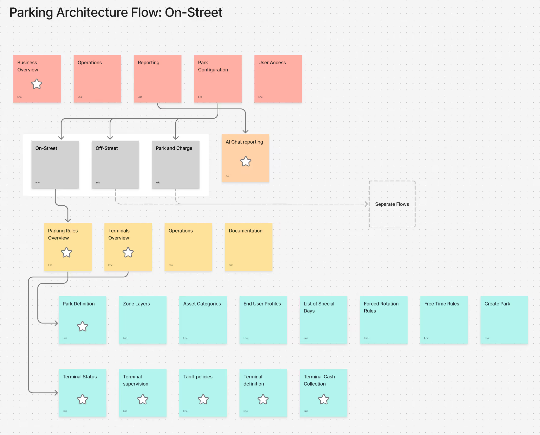
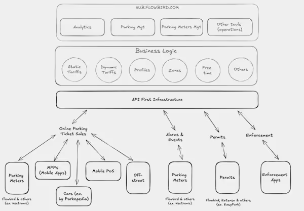
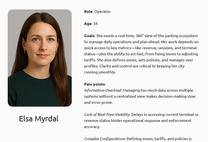
You can't design one view of a system until you've mapped the system.
The Hub reaches on-street meters, off-street lots, EV charging, payment terminals, and the back office behind all of it. Before any screen got drawn, the work was understanding how those pieces connect, who is accountable when one of them fails, and which of them an operator needs to see at once.
One screen instead of five tools
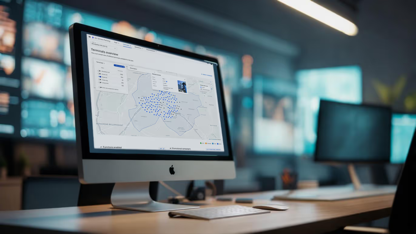
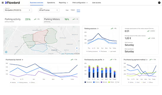
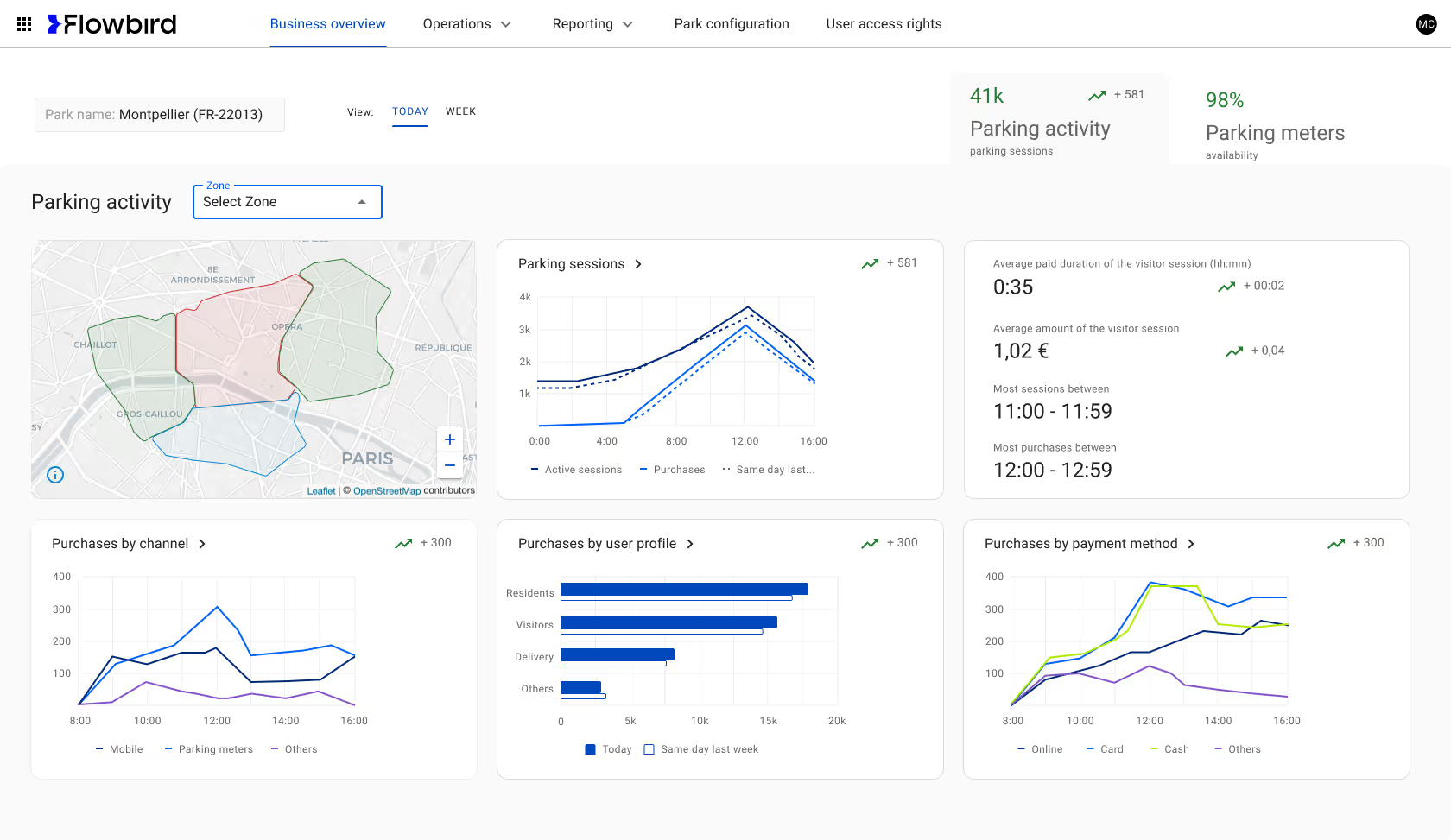
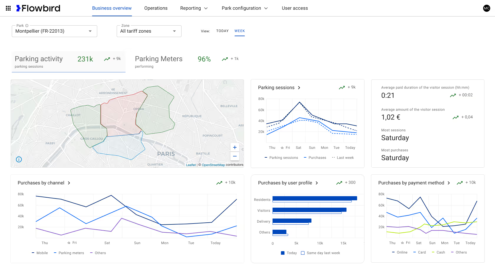
Parking activity, meter performance, revenue, and alerts moved into a single view, filterable by date and zone. An operator starts the morning knowing where to look rather than opening four tools to find out. The first version didn't survive testing: tab visibility and the relationship between labels, indicators, and sparklines all had to be reworked before people could read the page at a glance.
The map had to earn its space
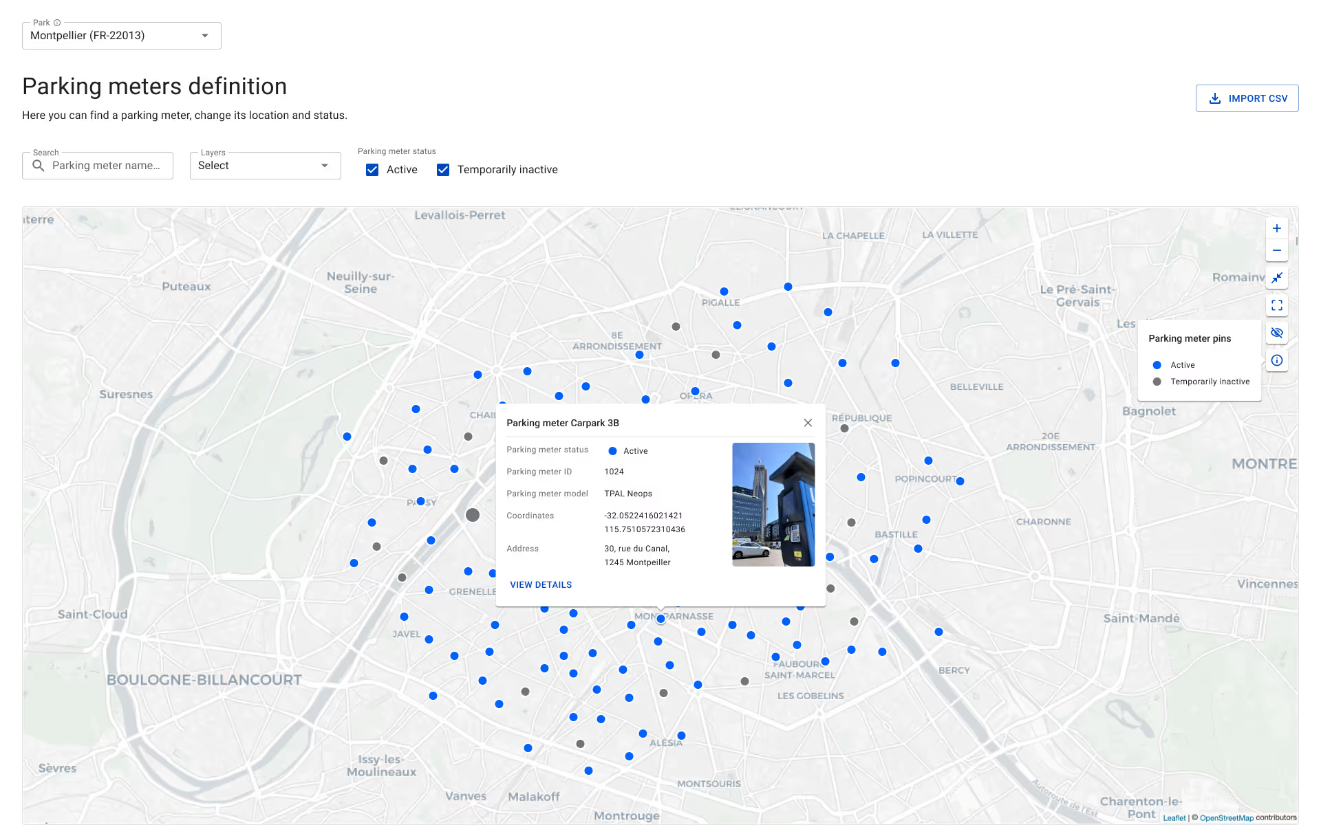
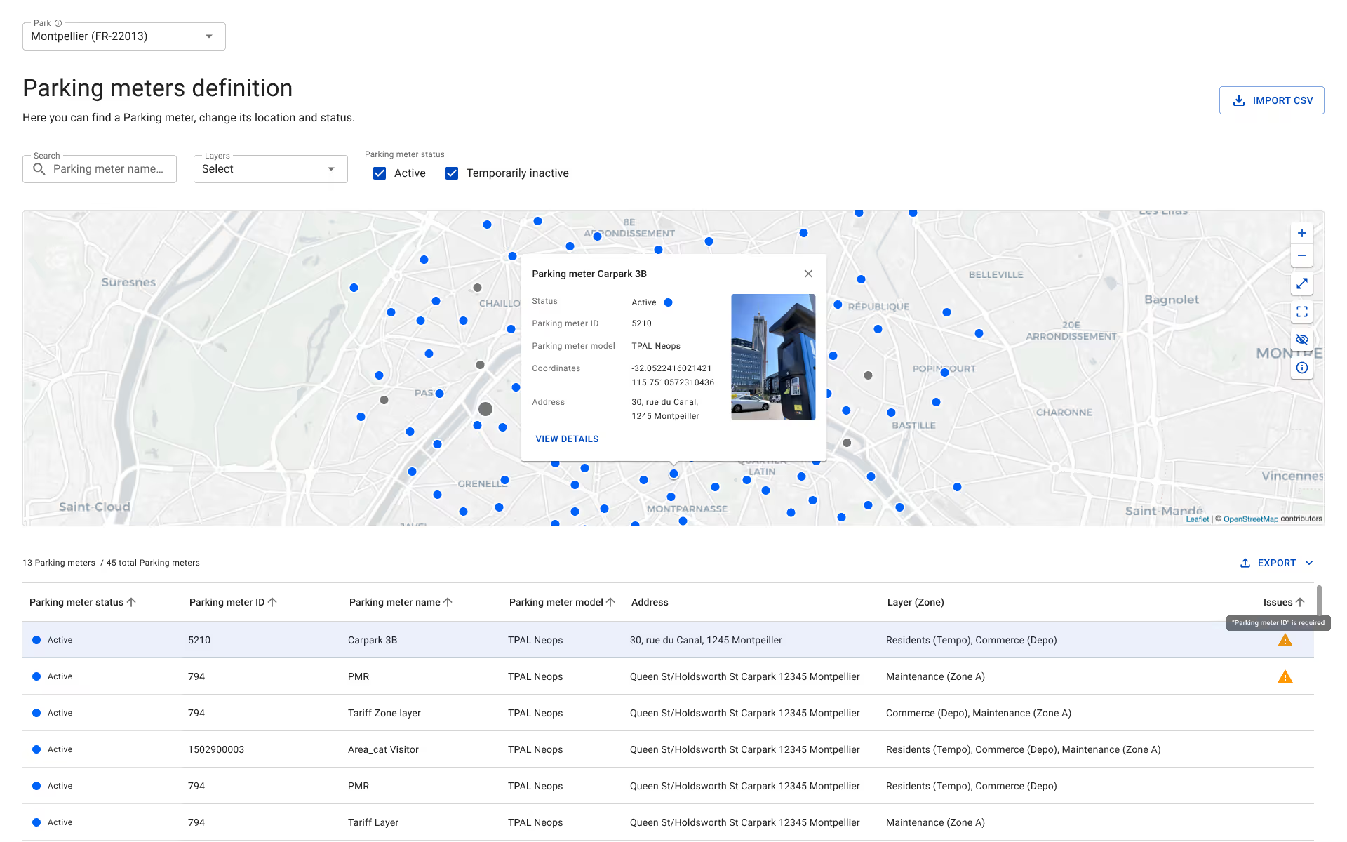
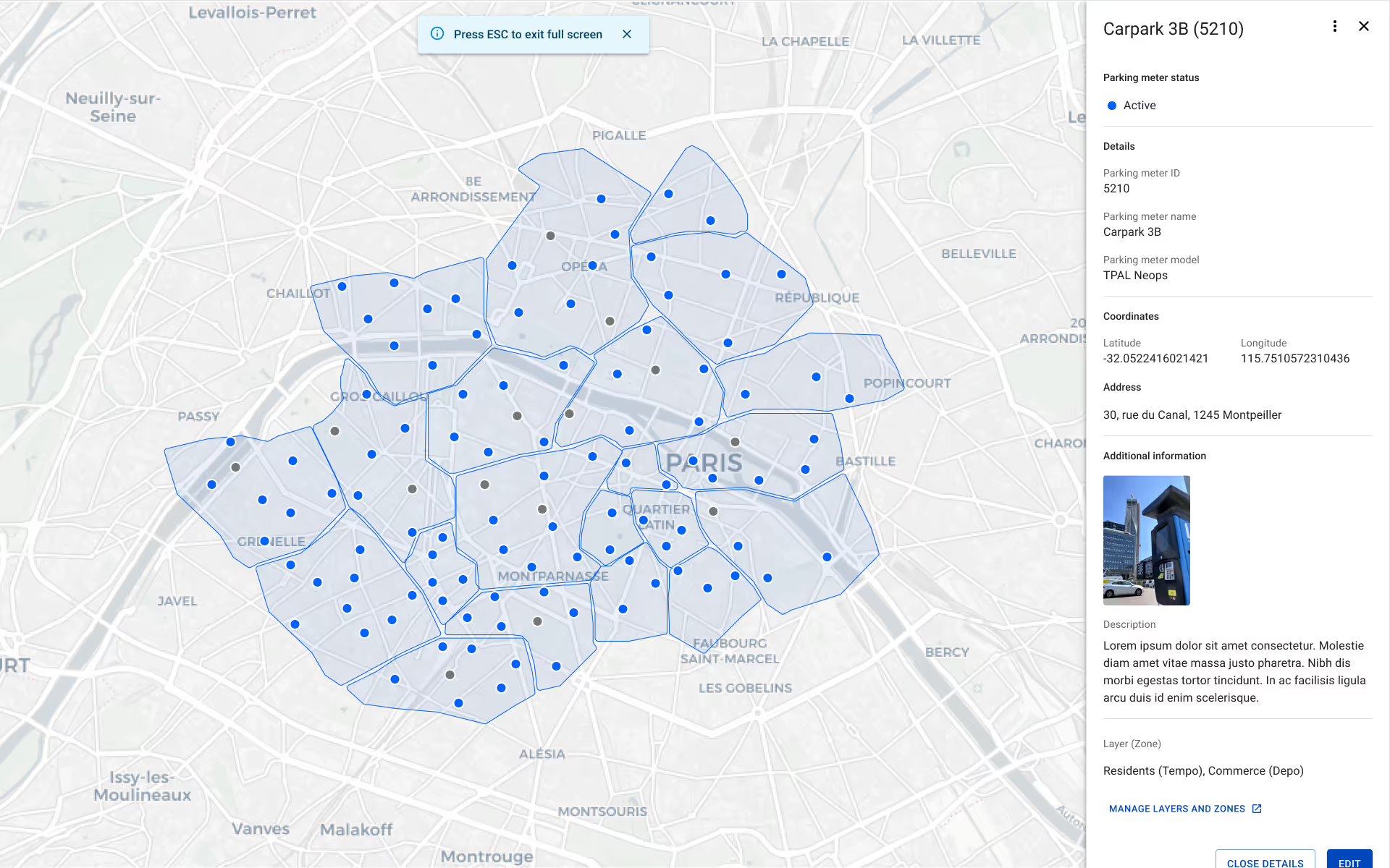
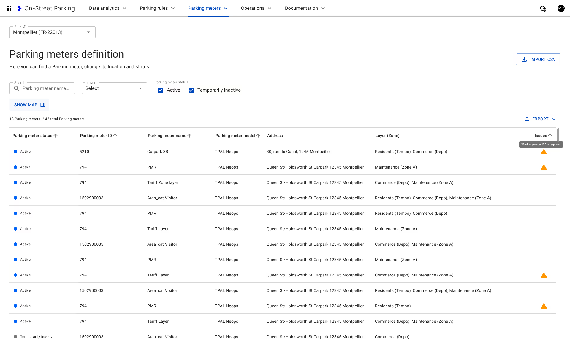
Testing showed the map mattered to most workflows, but not equally. Some operators work inside it; others want the table and nothing else. Rather than choose for them, the map became adjustable: full screen, default, minimised, or gone entirely.
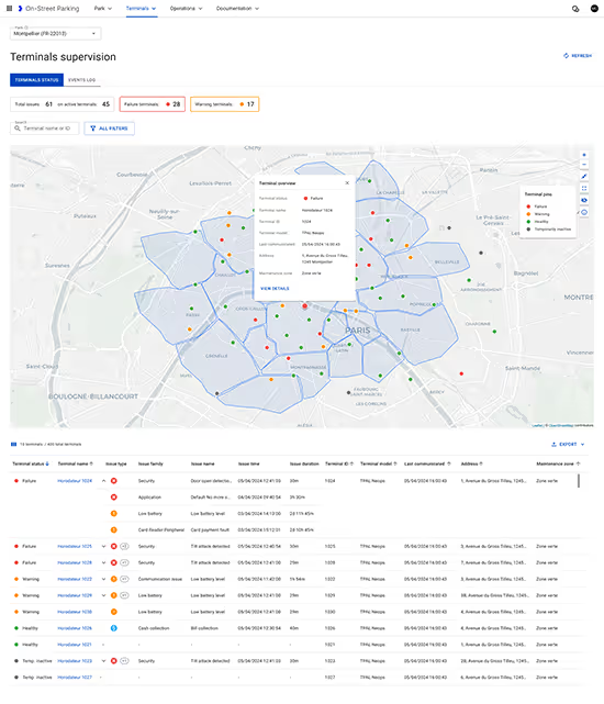
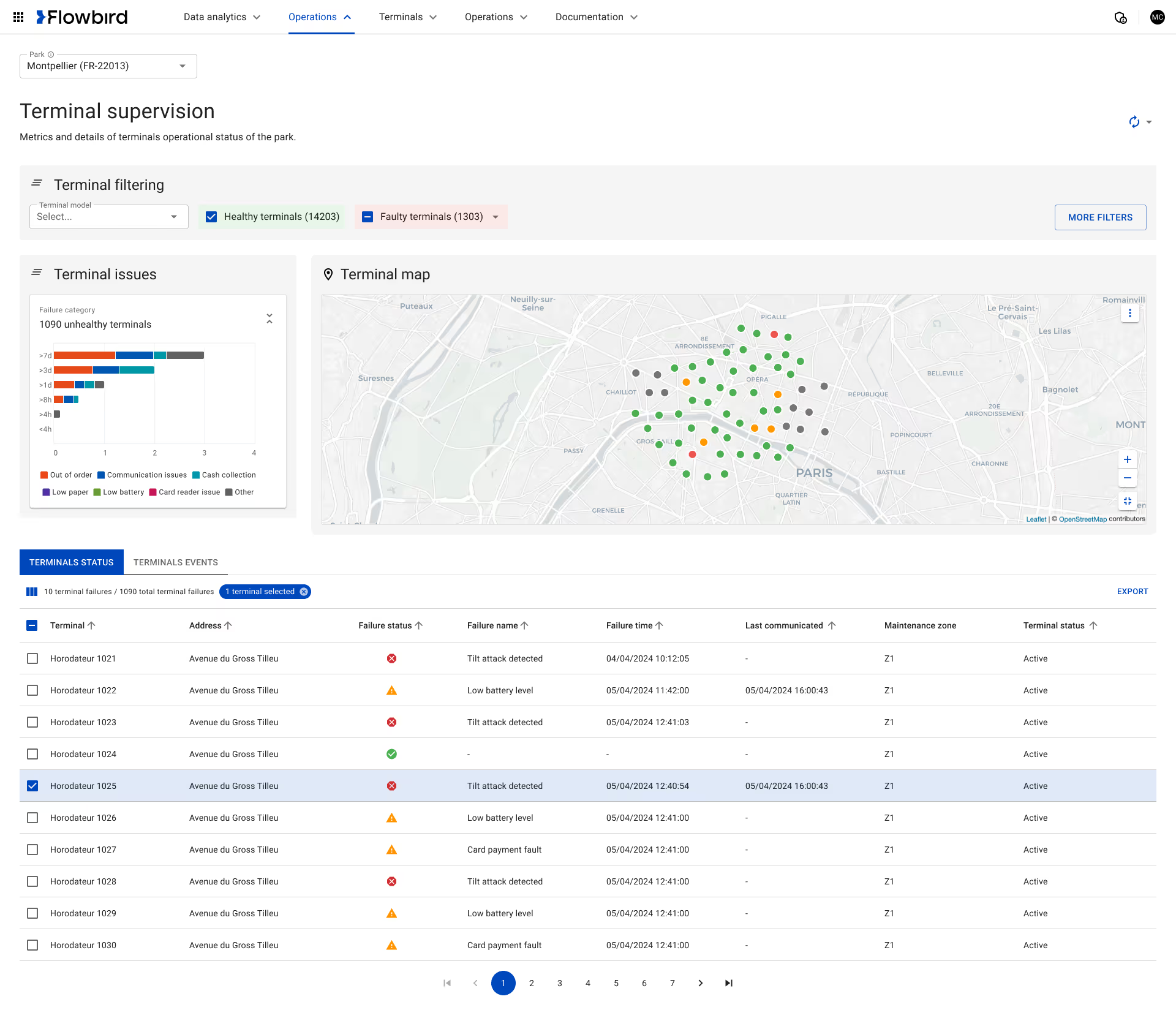
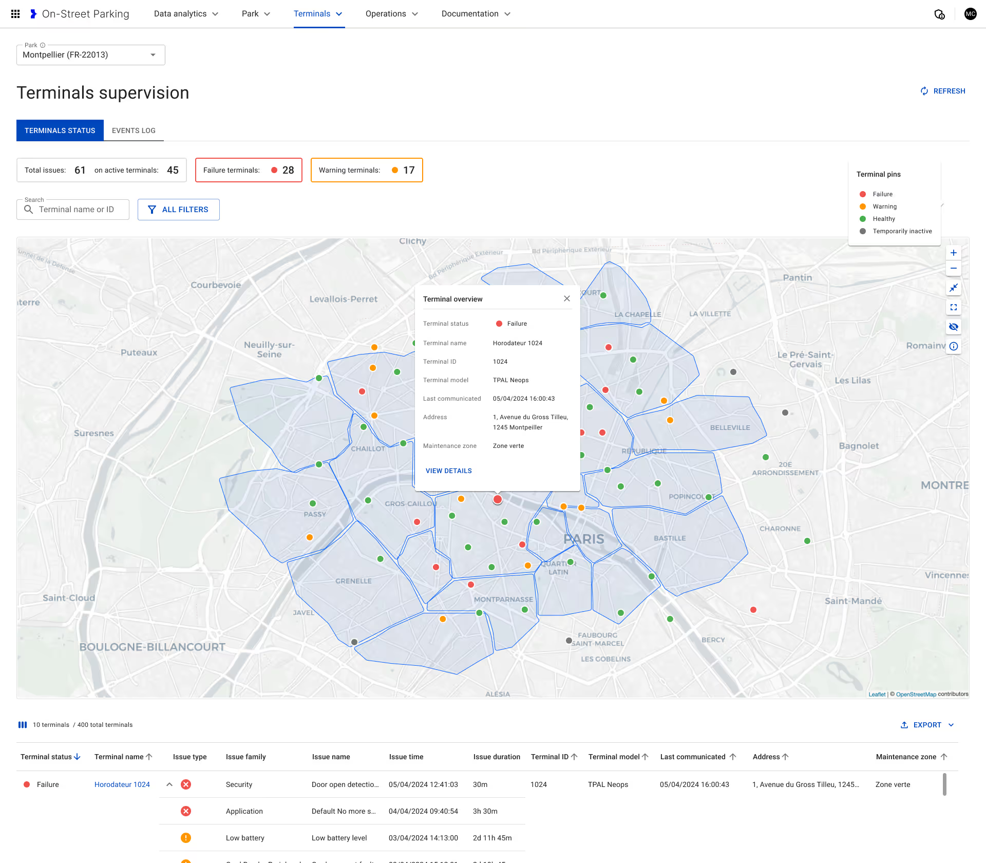
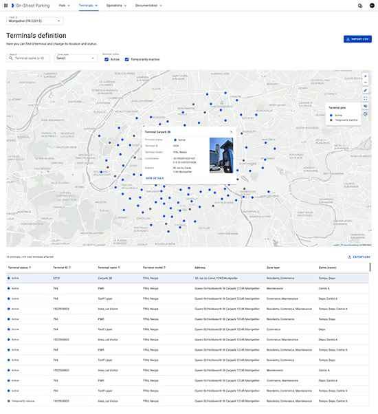
Find the failing terminal before someone calls
Terminal status, alerts, and history sit in one place, with drill-down that keeps the wider context visible. The filters and tabs moved after testing showed people lost their place the moment they investigated a single terminal.
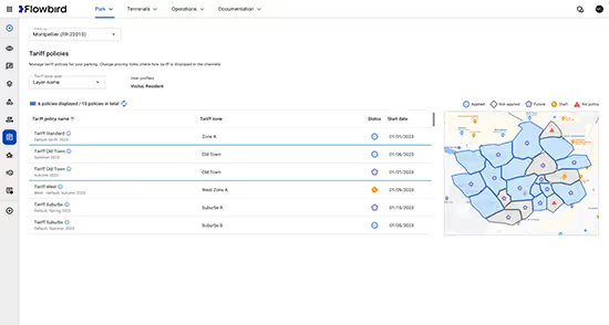
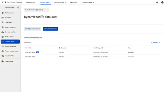
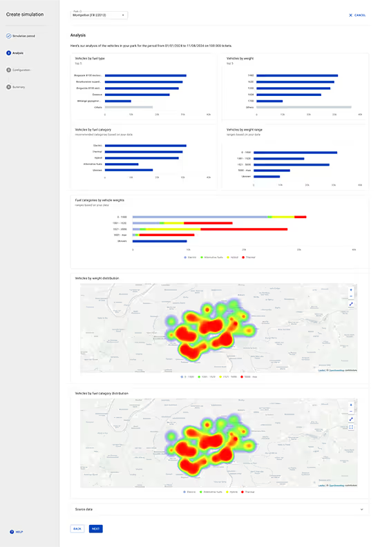
Model the change before it ships
Tariff changes used to be decided and then discovered. The simulator models revenue impact against historical data and traffic patterns first, so a pricing decision can be argued with numbers instead of instinct.
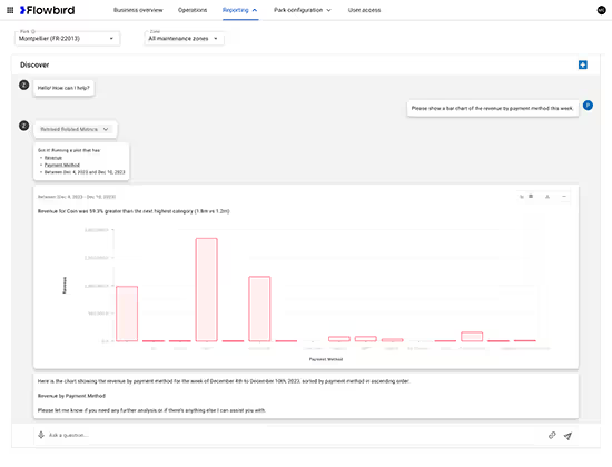
Ask the system instead of hunting through it
Operators ask in plain language for revenue by payment method, or for a date range, and get the metric back with a generated chart and a short summary. Reporting stopped being a task for whoever knew where the reports lived.
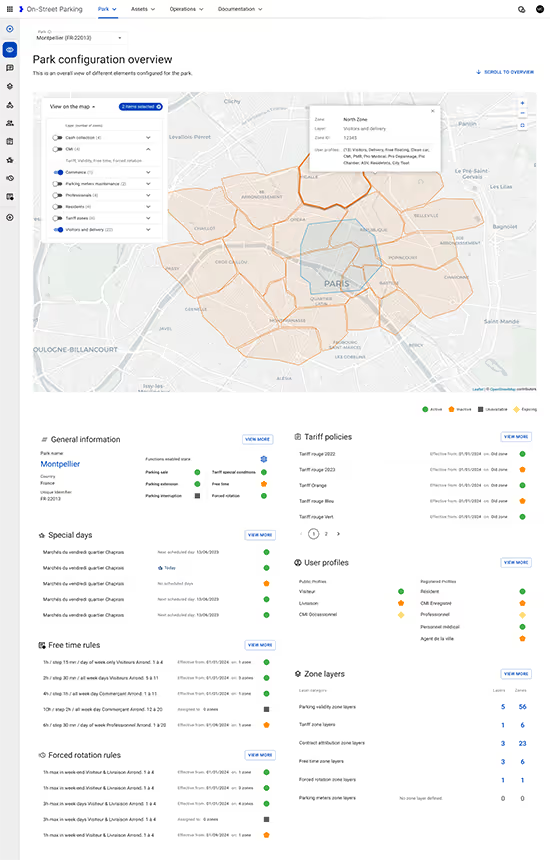
Everything else an operator has to keep straight
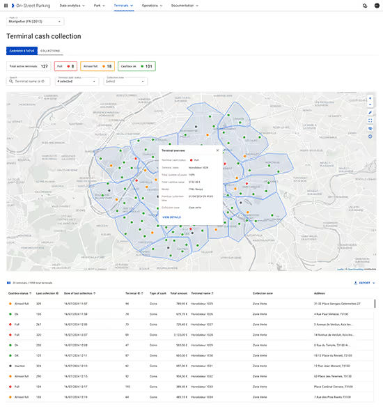
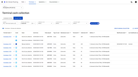
Zones and parking rules get configured once and apply across every sales channel. Terminal records stay current as hardware moves. Cash collection and reconciliation sit alongside the rest rather than in a separate system. None of it is glamorous, and all of it is the difference between a dashboard someone trusts and one they work around.
"Eric is an exceptional Product Designer, focused on usability and solving real business problems. Under his direction, the team developed UI/UX processes grounded in predictability, transparency, and a deep understanding of user challenges."

Key outcomes & value delivered
Operators now open one screen and see what needs attention, instead of assembling the picture from separate tools and hoping nothing was missed.
Parking ecosystems suppoted worldwide on the platform
Operators and city staff using it globally
Average boosted operational efficiency and revenue oversight
Common questions
You stop choosing for them. Testing showed the map was central to most workflows but not all of them, so it became adjustable rather than fixed: full screen, default, minimised, or hidden entirely. The alternative was picking a compromise that suited nobody. Flexibility only works where the underlying structure is consistent, which is why the architecture work came first.
Most dashboards show data. This was built around decisions. Every screen answers what needs my attention and what should I do about it, not just here are some numbers.

More choice isn't always more value.
Twenty years of in-store trust became a digital shopping experience customers could rely on.
Feathers
+24% increase in daily online sales • +13% increase in average order value
Let's talk about your project.
Every engagement begins by understanding where you are today, what you're trying to accomplish, and where thoughtful product design can create the greatest impact.