


Translating curated luxury vintage into a sophisticated digital shopping destination
For over twenty years, Feathers has been where people in Austin go to find a 1970s silk caftan, a coat with a hundred years behind it, a piece nobody else will be wearing. Natural fibers, one of one, chosen by hand. Some customers buy the way people buy art, and many of them have been coming since before the store had a website worth visiting.
That's the part that didn't survive the trip online. The site listed inventory. It said nothing about why any of it was there, and nothing about the twenty years of judgment that put it on the rack.
And every piece really is the only one. There's no restock, no second size, no waiting for it to come back. Which makes a moment of hesitation on a product page far more expensive here than it is for a retailer selling the same jacket a thousand times.
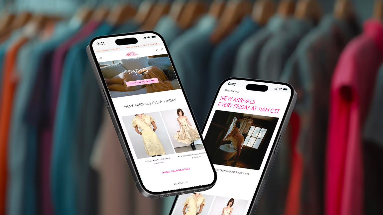
Feathers doesn't compete on more inventory. It competes on taste.
Which is a difficult thing to put on a product page. Taste isn't a feature, and judgment doesn't photograph. Every decision got tested against the same question: does this help someone see why this particular piece is worth having, or is it just another thing in a grid?
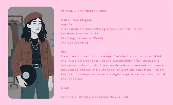
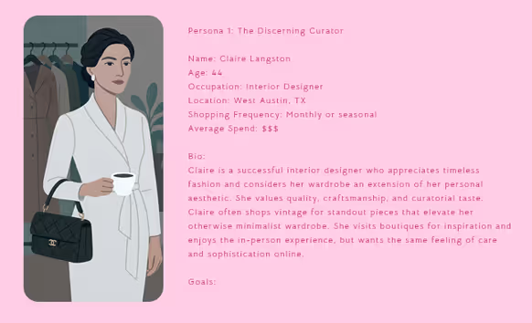
The customers were already looking for Feathers by name.
Discovery started with customer interviews, competitive analysis, and Shopify data, and the search data settled the strategy early: most visitors arrive looking for Feathers specifically, not browsing vintage generally. That ruled out the obvious growth move. A bigger catalog would have diluted the exact thing people were coming for.
The experience had to earn the purchase.
Every page had two jobs: express what made Feathers worth discovering, and create the confidence to own something truly one of a kind. Storytelling created desire. A strong brand, honest product details, and thoughtful interactions removed the reasons to hesitate.
The old website
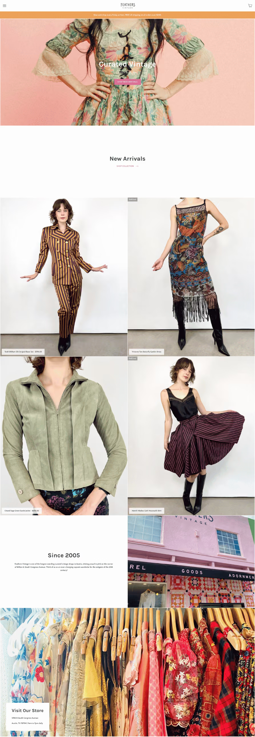
The redesigned website
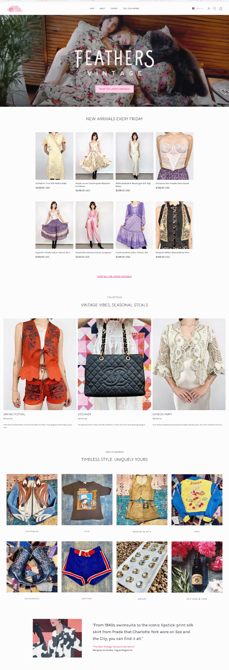
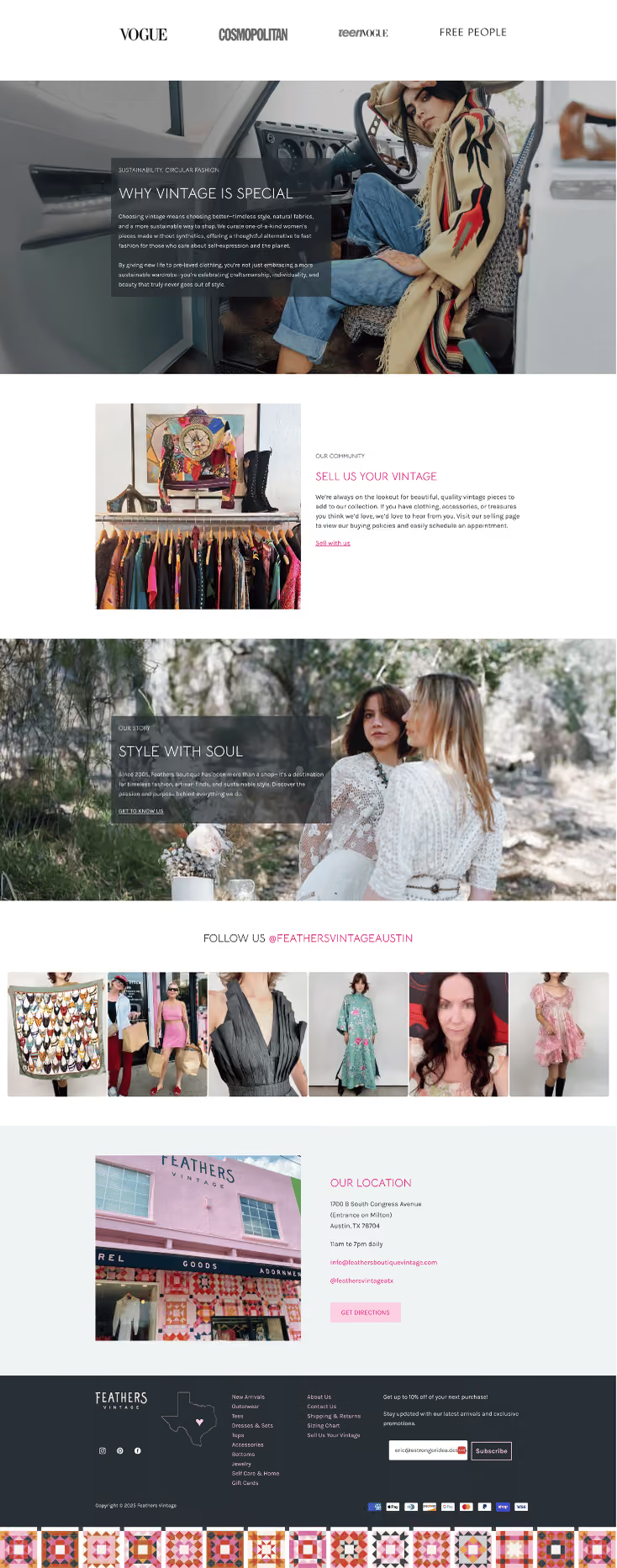
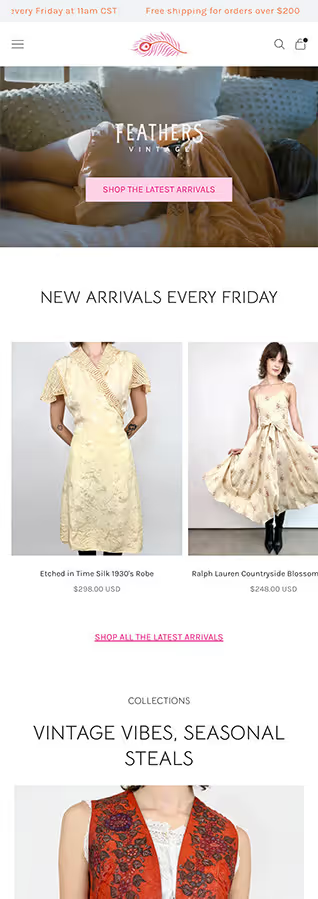
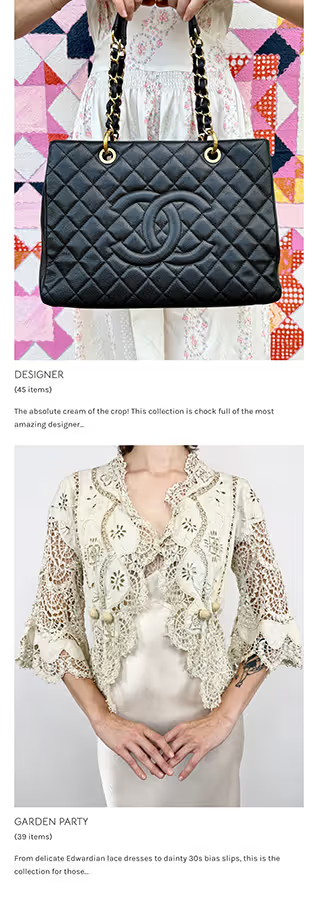
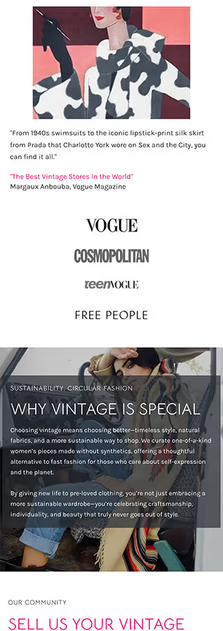
The homepage made the reputation visible.
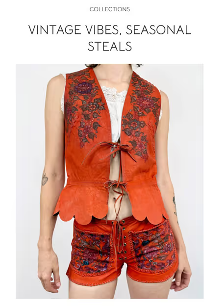
Fresh arrivals, curated collections, press, and the South Congress address, arranged so the first screen answers three things at once: is this for me, can I come see it, and who is this. Vogue's Vintage Directory put Feathers in its guide to the best vintage stores in the world, describing a place where you can find everything from 1940s swimsuits to a Prada piece worn on Sex and the City. Emily's own path, from her grandmother's antique mall to costume design to FIT, is why the curation gets trusted. None of it was visible before.
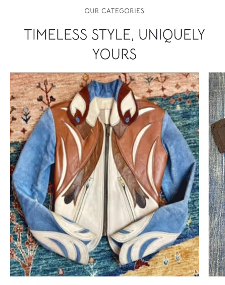
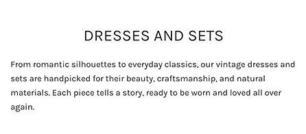
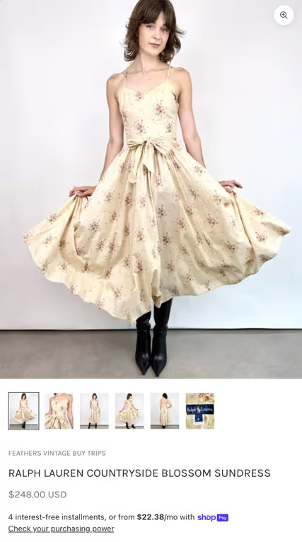
Nobody buys a hundred-year-old coat because of the measurements
They buy it because they believe the story: where it came from, what it's made of, who made it, why it survived. The measurements exist to remove reasons to doubt that story, not to replace it. So each listing does what a good salesperson does on the floor. The weight and hand of the fabric. Where and roughly when it was made. How it sits on a shoulder. What the wear on a hem means, and whether it matters. Photography that shows the garment as an object rather than styling around it. None of that is optional when there's only one. And doing it consistently for a catalog that turns over every week meant the process behind the listing had to be designed too, not just the page.
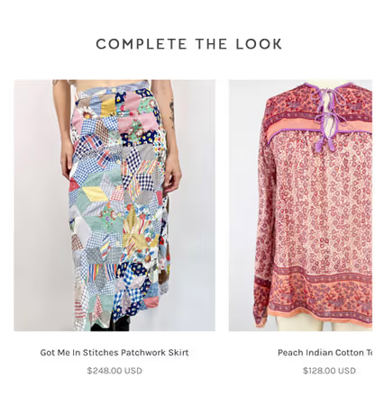
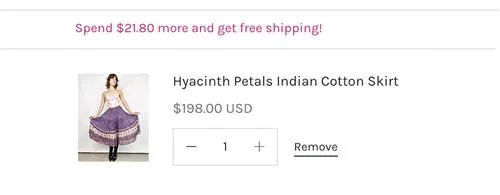
Complete the look, not "customers also bought"
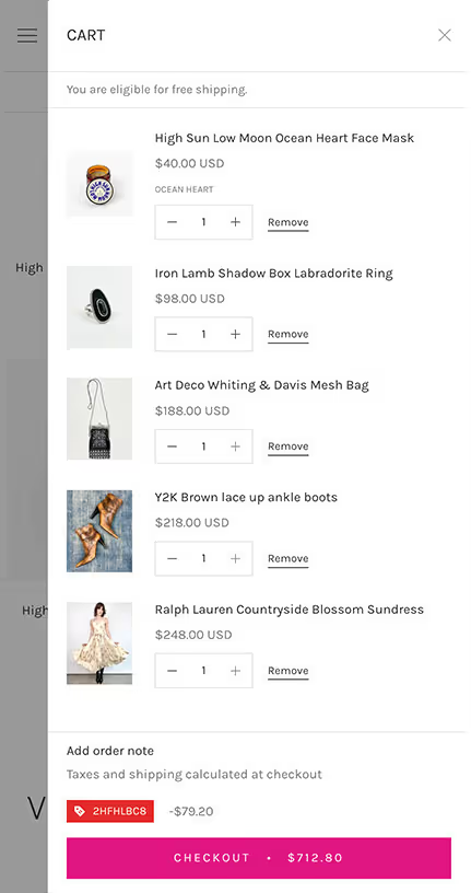
Recommendations built to extend the feeling of being chosen for rather than sold to. A caftan suggests the boots someone would actually wear it with, not the four items with the highest attach rate. Free-shipping progress sits alongside, so the nudge toward a larger basket reads as information rather than pressure.
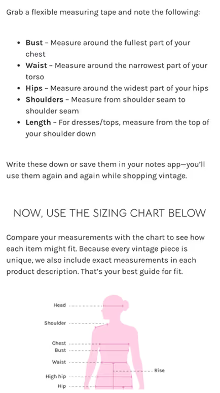
Each product page now includes detailed sizing guidance and styling notes. These enhancements reduce hesitation and increase buyer confidence, especially for one-of-a-kind vintage items where clarity matters most.
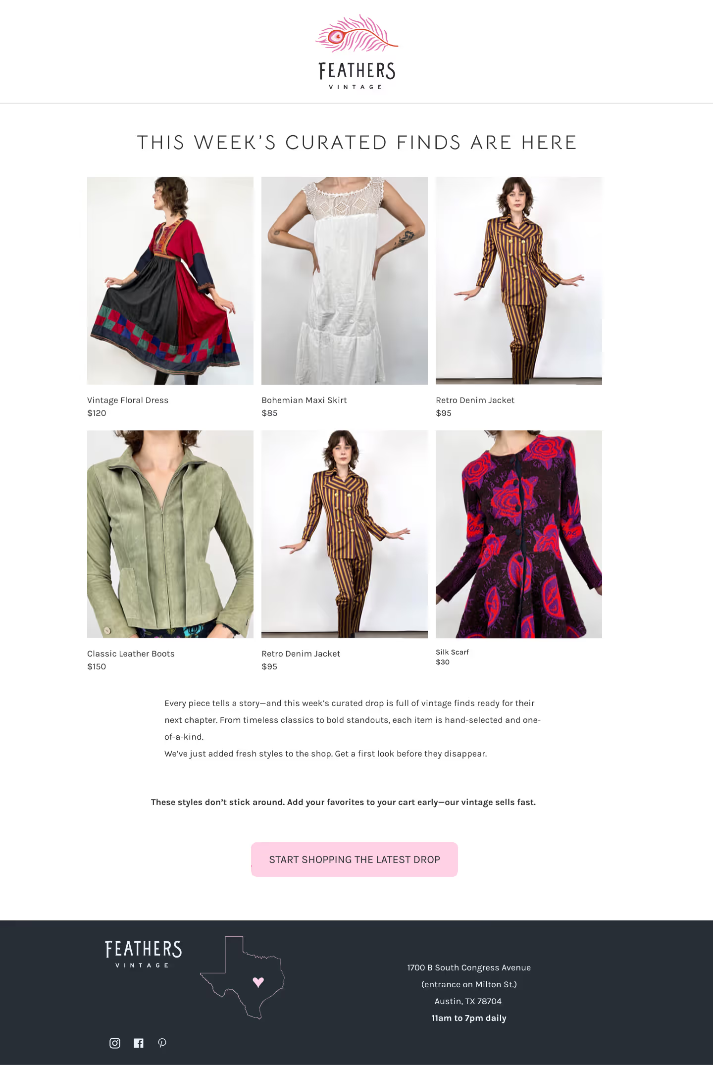
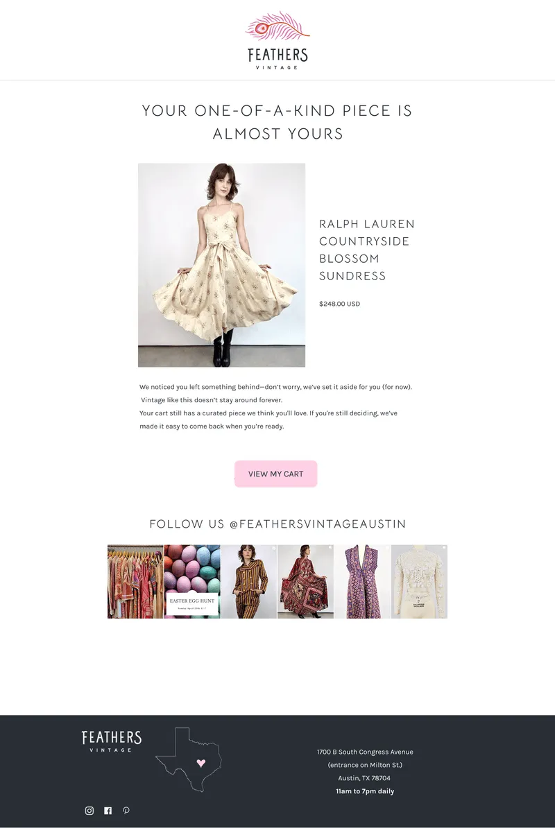
One-of-a-kind products deserve different follow-up.
Automated follow-ups reflected the one-of-a-kind products customers had been considering instead of sending generic reminders. A new newsletter strategy kept Feathers connected to shoppers through new arrivals, curated collections, and the stories behind them, while win-back campaigns re-engaged customers who hadn't purchased in some time. Behind it all, a brand voice system made every message feel unmistakably Feathers while giving the team a consistent foundation for AI-assisted content as the business continues to grow.
Taste is harder to scale than inventory
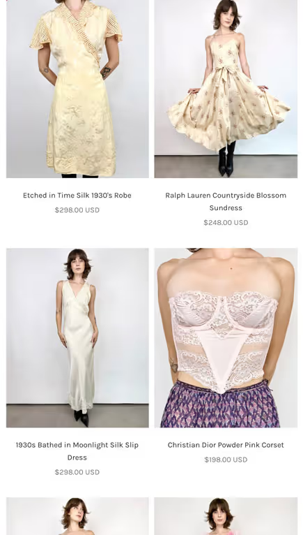
The challenge was never keeping inventory moving. It was keeping judgment consistent as inventory moved. Every week brings pieces that each need their own description, their own photography, their own reason to exist on the page. That's the part that breaks first when a store like this grows: not the stock, the standard.AI-assisted product writing and short generated video hold the pace without flattening the voice, which stays split between Emily speaking personally and the shop speaking as a shop. The garment moves, which a still photograph of vintage silk never quite manages.
Growing online strengthened the store.
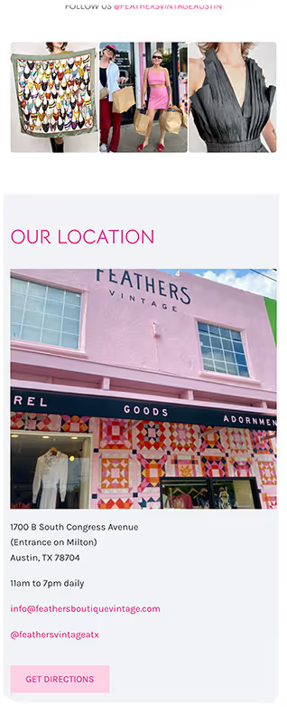
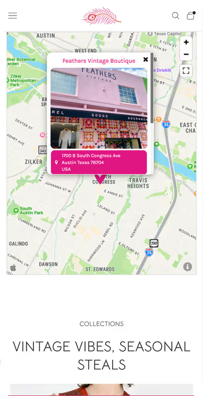
Digital commerce expanded Feathers' reach without replacing what made the boutique special. Clear store information, in-store pickup, local events, and exclusive promotions connected the online and in-person experience, allowing each to reinforce the other.
"Feathers has always been about curation, quality, and style—and now our website finally speaks that language. The transformation was thoughtful, strategic, and stunning."

Key outcomes & value delivered
Within 30 days of launch, online sales went from 2–8% of weekly revenue to 10–20%.
Increase in average daily online sales
increase in average order value
increase in website sessions
Common questions
Because it isn't a philosophy, it's economics. Photographing, measuring, describing and maintaining a one-of-a-kind piece takes real labor, and that labor only repays itself on the higher end of the inventory. The pieces that go online are the ones most worth the attention, which is also what performs best there.
Yes, meaningfully. A normal retailer can afford some uncertainty on a product page because the item will restock. Feathers can't. Hesitation can mean losing that piece forever, so the design has to build confidence before checkout, and the process behind it has to sustain that standard week after week.
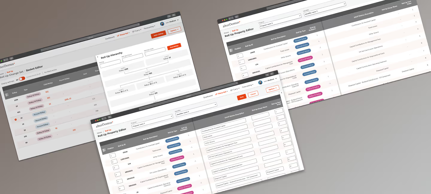
Expert users don't need less complexity. They need less friction.
Expert workflows stayed intact while the friction around them disappeared.
Euvic × AlterDomus
45% improvement in user satisfaction • 25% reduction in time on task
Let's talk about your project.
Every engagement begins by understanding where you are today, what you're trying to accomplish, and where thoughtful product design can create the greatest impact.