


Expert users don't need less complexity. They need less friction.
Euvic brought me in to work alongside their team on CapAssure, a platform used by fund administrators and advisors managing serious money under real regulatory constraint. Expertise ran a wide range across them. Some lived in the system every day and knew it better than anyone. Others opened it a few times a quarter and still had to be right the first time.
What none of them had was consistency. Interfaces varied across workflows, data-dense tables were hard to interpret quickly, and small inefficiencies compounded at scale into real operational and compliance risk. Simplifying the platform for a beginner would have insulted the people using it. The actual problem was different: reduce the friction, keep the sophistication.
The platform had led its market long enough that the experience stopped being anyone's priority. That works until a competitor shows up with the same capability and a better experience. Then the lead that felt safe is the thing that puts you at risk.
Not every complex problem should be made simple. Some should just be made clear.
Rather than remove complexity, the redesign focused on preserving context. Experts could move from overview to detail without losing their place, and work at speed without sacrificing accuracy. Expandable rows let someone drop into the numbers that mattered without ever losing sight of the bigger picture.
That one decision set the rule for everything after it. If you had to leave a screen to answer a question, the answer came back without its context. You then had to rebuild that context yourself before you could act.

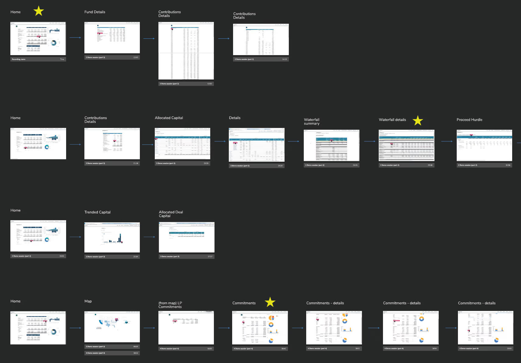
Every screen, and the paths between them
The first artifact was a map of the existing product, screen by screen, arranged by the routes people actually took through it.
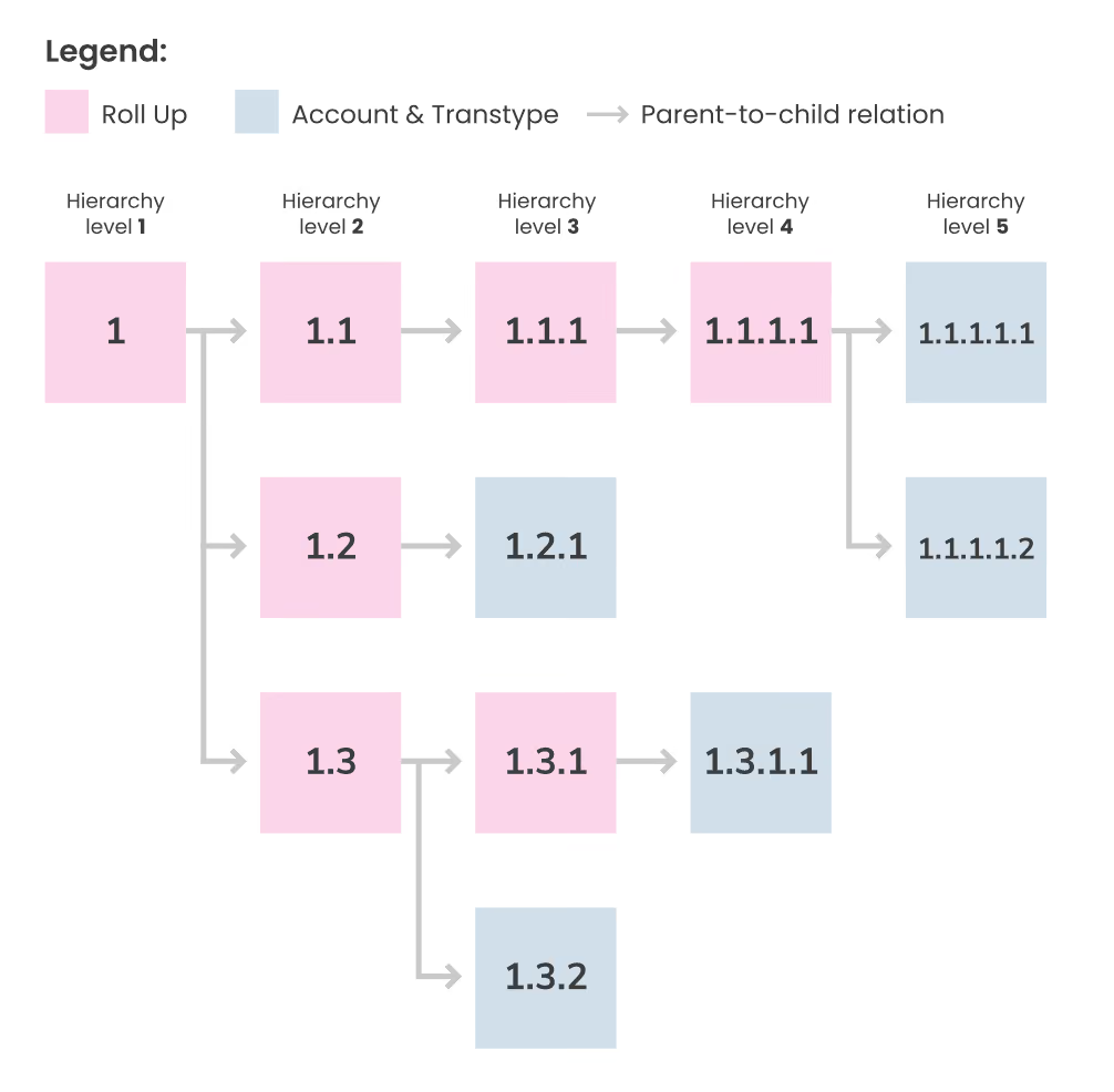
The second was a roll-up hierarchy, drawn so users could be asked a question nobody had put to them: when you search a structure like this, how far should the results reach? Mapping what existed and testing what people expected of it came before a single screen was redrawn.
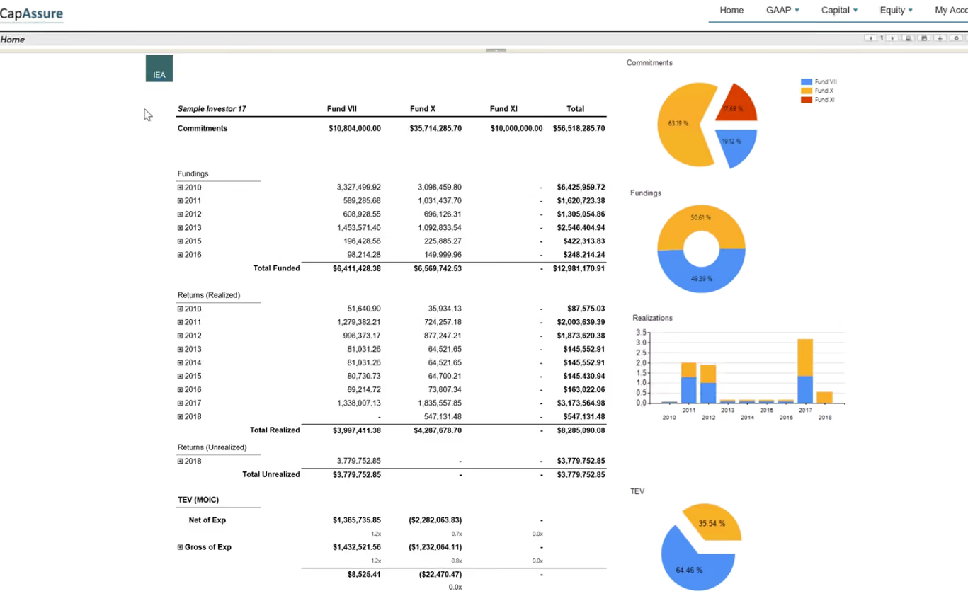
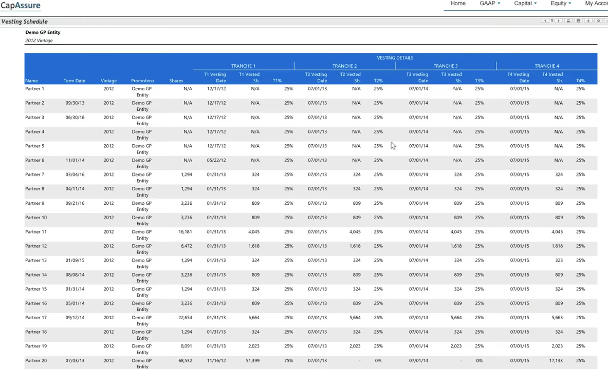
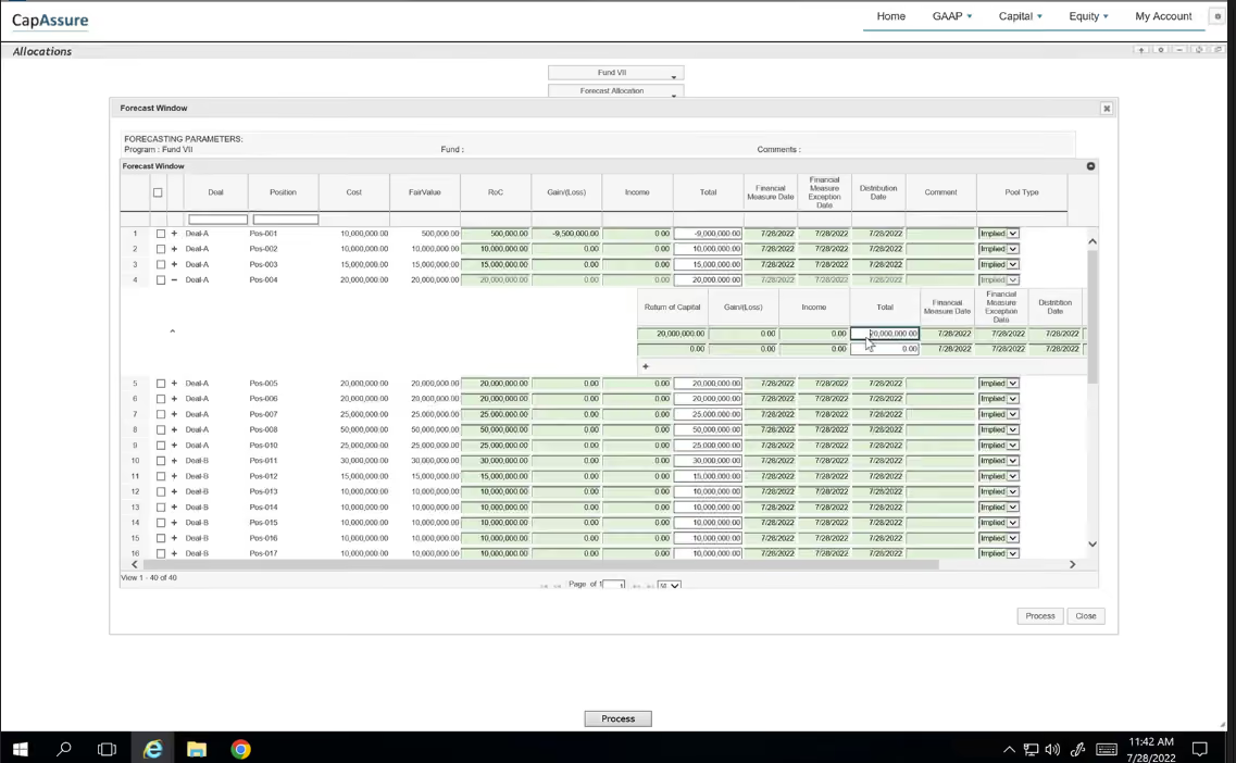
The old product: Capability wasn't the problem. Understanding and using it was.
These screens are a fair sample of the initial state of the product. The old CapAssure already contained the functionality fund administrators and advisors needed. The challenge wasn't adding capability. Years of engineering-led growth had produced a platform that demanded too much of its users before they could do the work they were already experts at. Powerful software shouldn't require people to master the interface before they can apply their expertise.
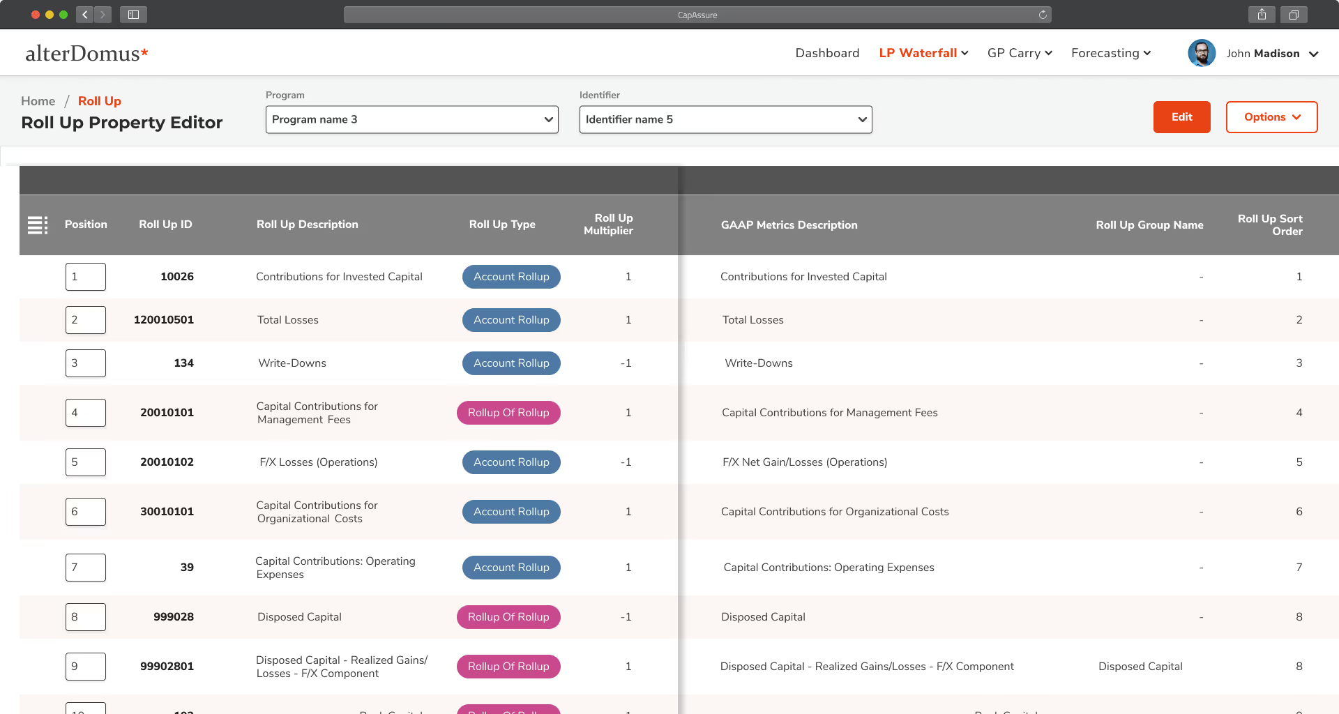
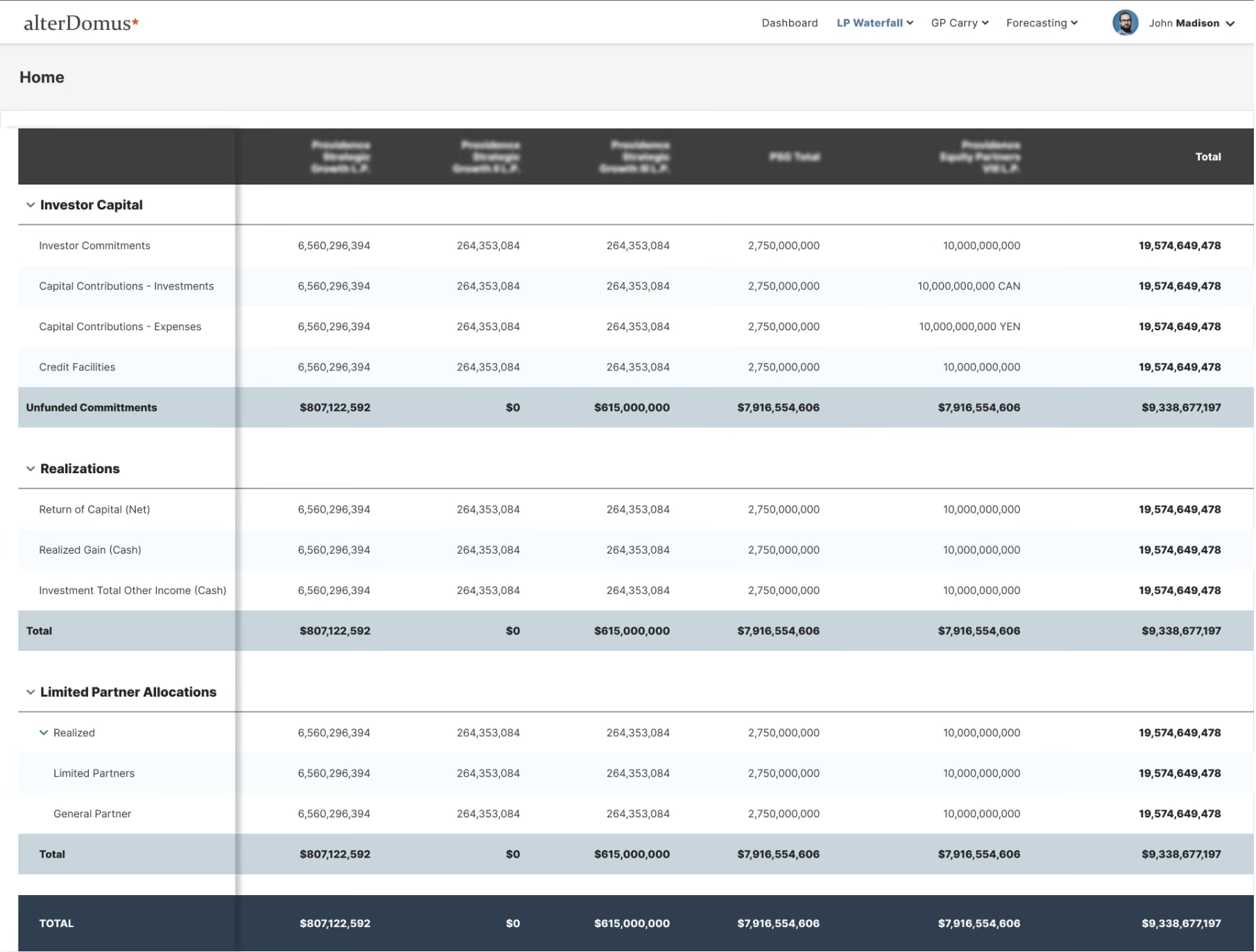
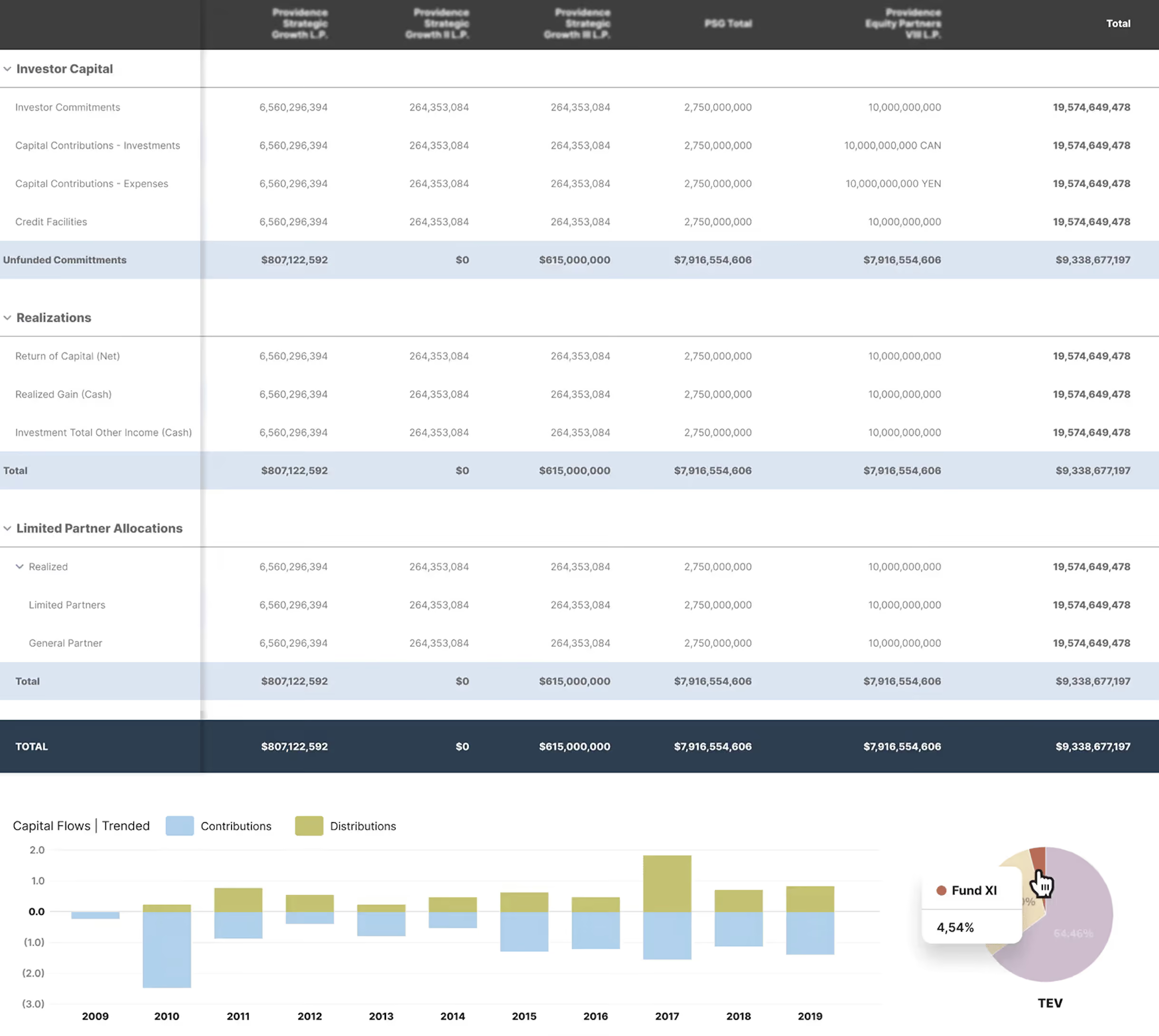
The same numbers, made clear and actionable
The old screens showed everything at once and gave no clue what mattered most. I set a clear hierarchy using white space, type size, and color contrast. The numbers that drive a decision now stand out first. Everything else is still there when you need it.
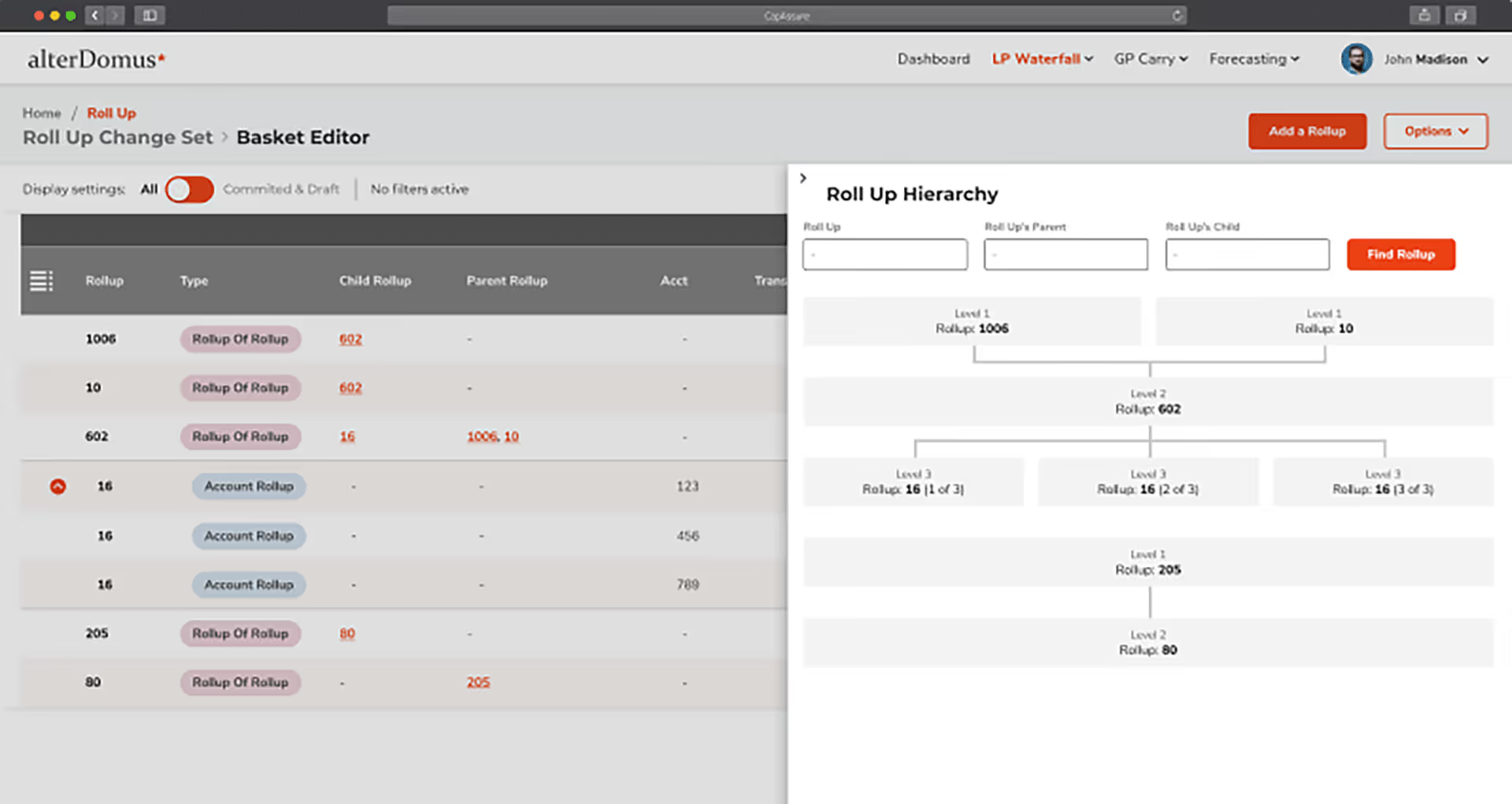
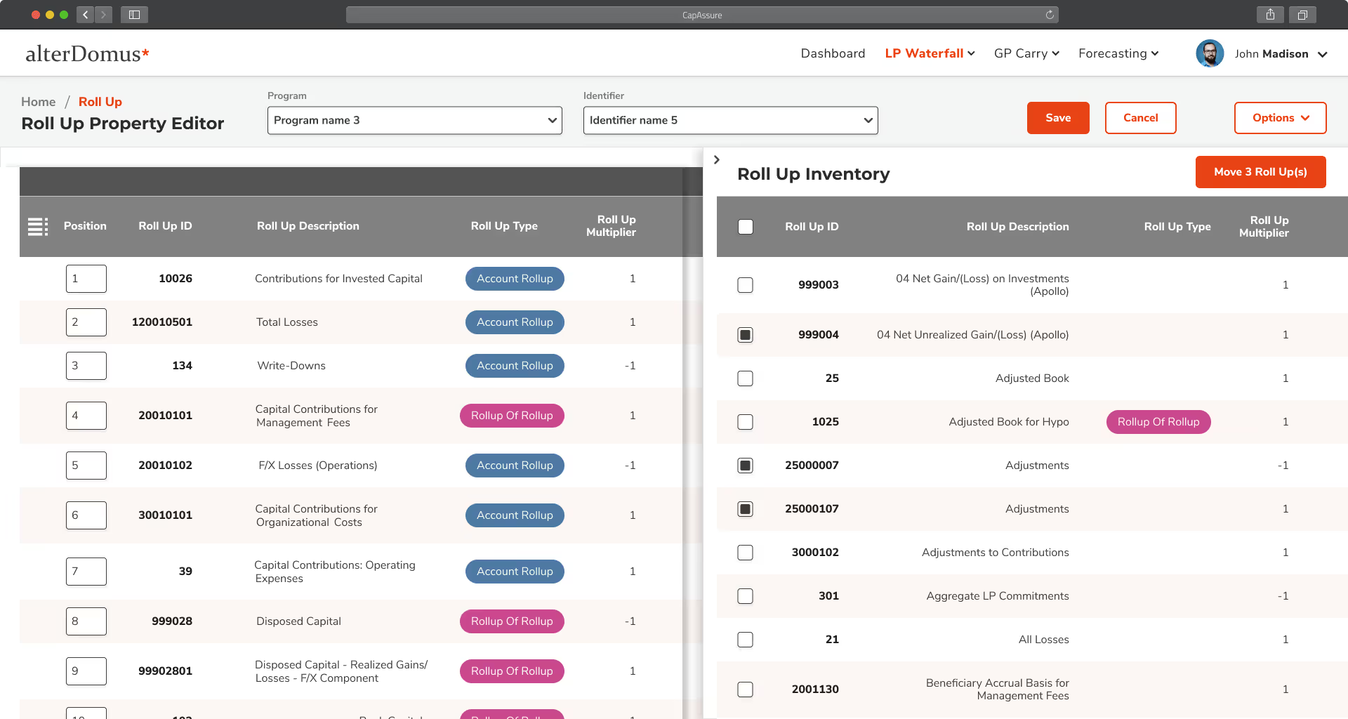
Detail and action without leaving the page
Answering a question used to mean leaving the screen that raised it. Coming back, you had to find your place again. Side panels and expandable rows now open the detail right where you are, and let you act on it there. The overview never disappears.
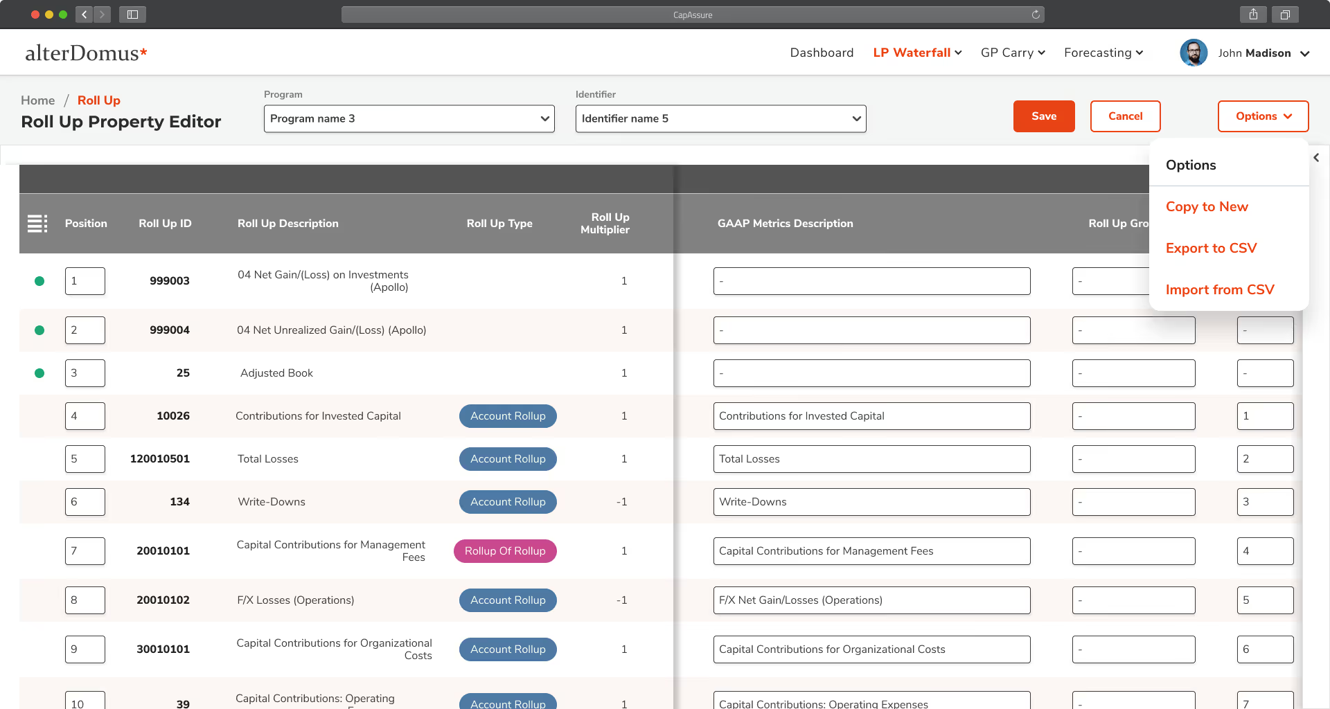
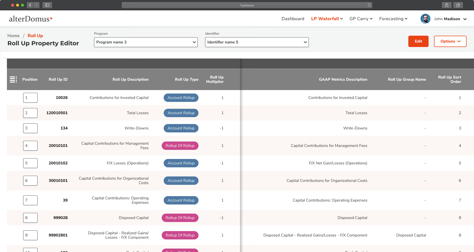
A better interface makes the data work harder
We rewrote the interface text so the next step is stated, not guessed at. Color and shared components are used to mean something, not to decorate. When the stakes are this high, a vague label isn't a style problem. It's the moment someone does the wrong thing.
A structure nobody could see, made navigable, informative, and usable
Roll-up structures run five levels deep. Before this, they lived in spreadsheets that nobody could hold in their head. I led the design that put the structure on screen, so you can move through it instead of rebuilding it. Parents, children, and dependencies are all visible at once.
"A Stronger Idea Design brought a rare mix of big-picture thinking and meticulous detail. The design leadership work helped streamline complexity, and the collaborative style made them a trusted partner across the board."

Key outcomes & value delivered
Both satisfaction and speed improved. Neither came from taking capability away from the people who rely on the platform.
Improvement in user satisfaction
Reduction in time on task
Platform context, not an outcome: 150+ funds supported, individual funds up to $20B in AUM.
Common questions
By changing what people see, not what the system does. Calculations, controls and audit paths stayed exactly where they were. The work went into hierarchy, wayfinding and language, which is why the platform could feel current without a single trusted workflow being reopened.
I did, as design lead for the engagement, working directly with Euvic, the product owners and engineering. I led the highest-complexity financial workflows myself and directed a supporting designer on the rest. Euvic held the contract. The design direction was mine.

Complexity is invisible until customers feel it.
Years of accumulated capability became a parking experience that feels simple, even when the system behind it isn't.
Flowbird Park Detroit
200,000+ transactions per month • 4.6/5 App Store rating
Let's talk about your project.
Every engagement begins by understanding where you are today, what you're trying to accomplish, and where thoughtful product design can create the greatest impact.