

Estate planning is emotional and complex. Design makes the hard decisions easier.
Advisors and attorneys served clients making some of the biggest decisions of their lives, decisions about family, wealth, and what happens after they're gone. The platform needed to hold that weight without becoming another obstacle in an already heavy process.
It served advisors, institutions, attorneys, and clients, each with different expertise and a different stake in the same decision. As the product grew, that complexity started showing up in the workflows themselves: friction, confusion, and the kind of small errors that are hard to walk back in estate planning specifically.
The stakes weren't only personal. Estate Guru was positioning for a share of a $124 trillion intergenerational wealth transfer, and a platform competing for that has to feel trustworthy before it can feel useful.
Clarity here isn't a nice-to-have. It's what keeps a legally complex process from becoming a mistake nobody catches until it's too late.
Every workflow got tested against one question: does this help someone make a better decision, or does it just look thorough?
Step-by-step guidance with visible progress answered the first. A form that assumed people already knew what came next answered the second.

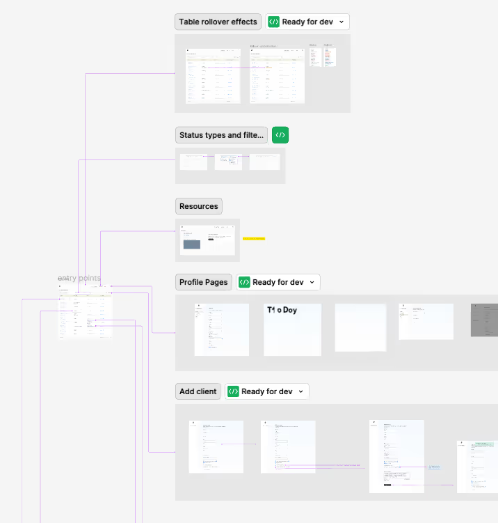
Three roles. One screen.
An advisor needs to act. An attorney needs to verify. A client needs to understand what's happening to their own estate. Early on those looked like three products. The work was finding the structure where they could be one, without any of the three feeling like an afterthought.
Better decisions create simpler experiences.
The goal wasn't removing complexity. It was deciding where it belonged, and keeping it out of the moments when someone needed a quick answer and a clear choice.
Every decision got tested against the same question: does this reduce uncertainty, or add to it? Real-time availability answered yes. A system that made people guess wouldn't have.
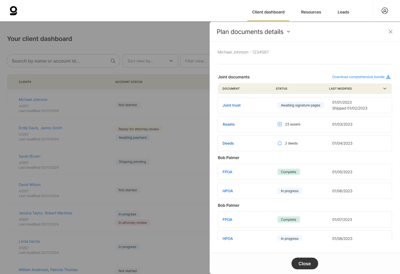
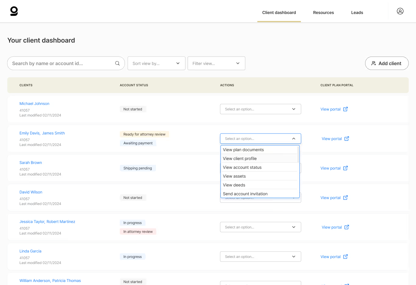
Everything that matters, on one screen
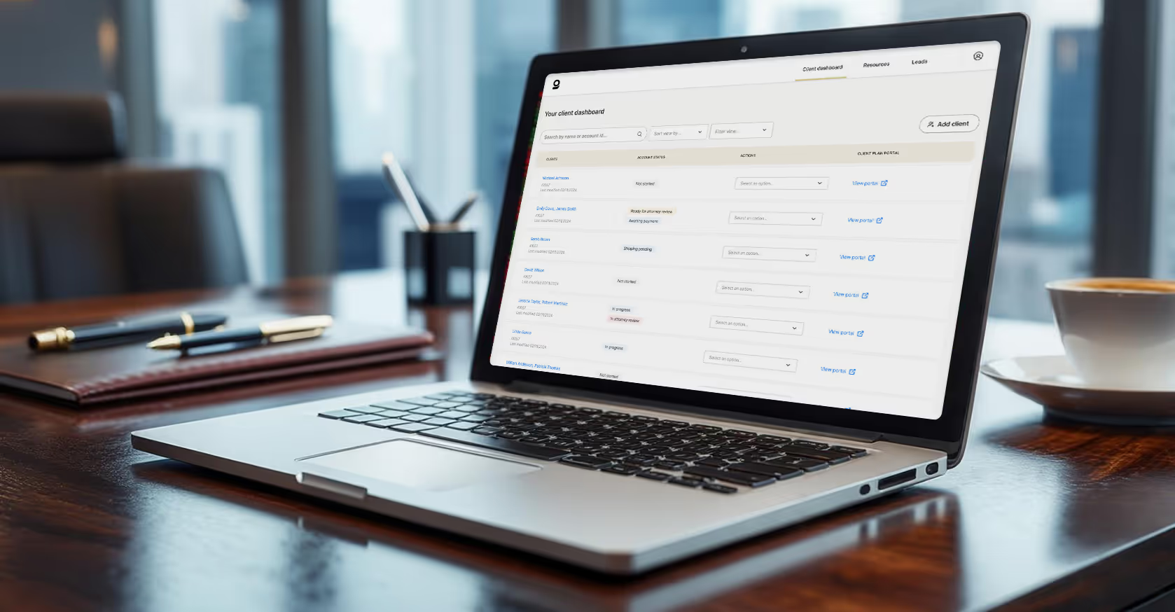
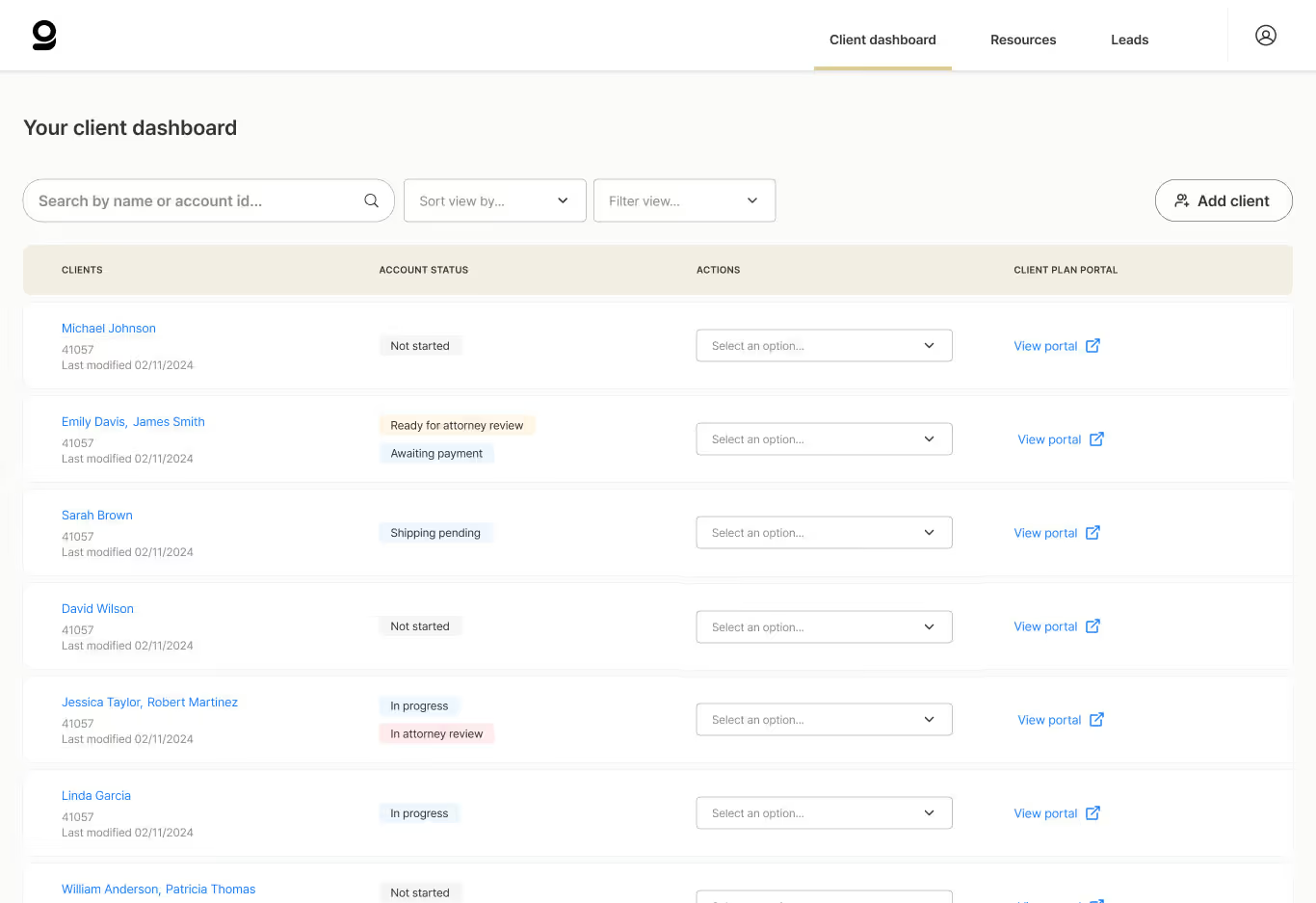
Client profiles and account status sit in a single scannable layout, so an advisor can see where things stand and act without opening four tabs first. Less to hold in your head at the moment the decision gets made.
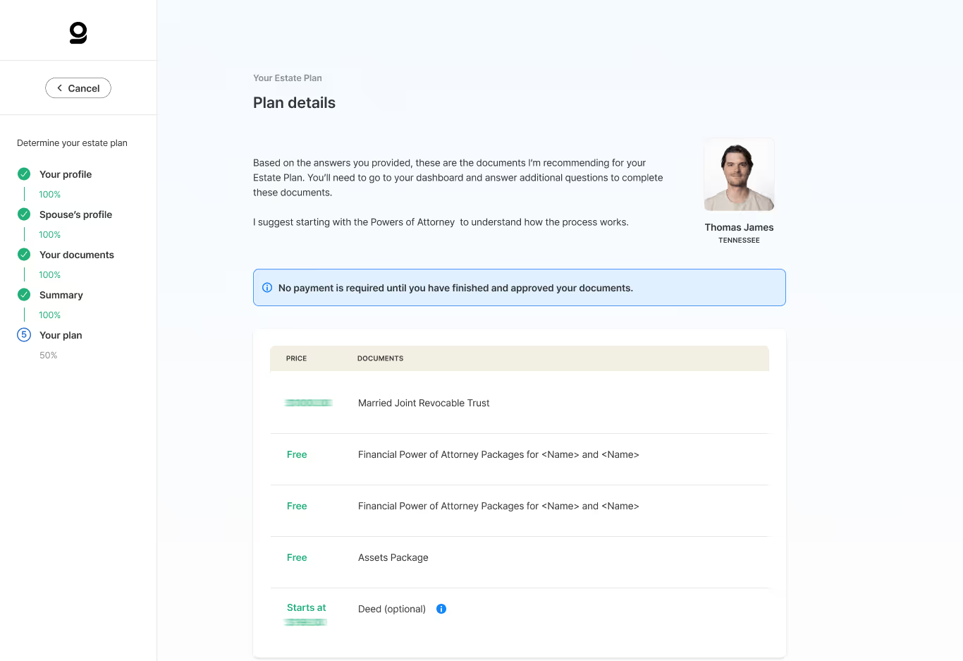
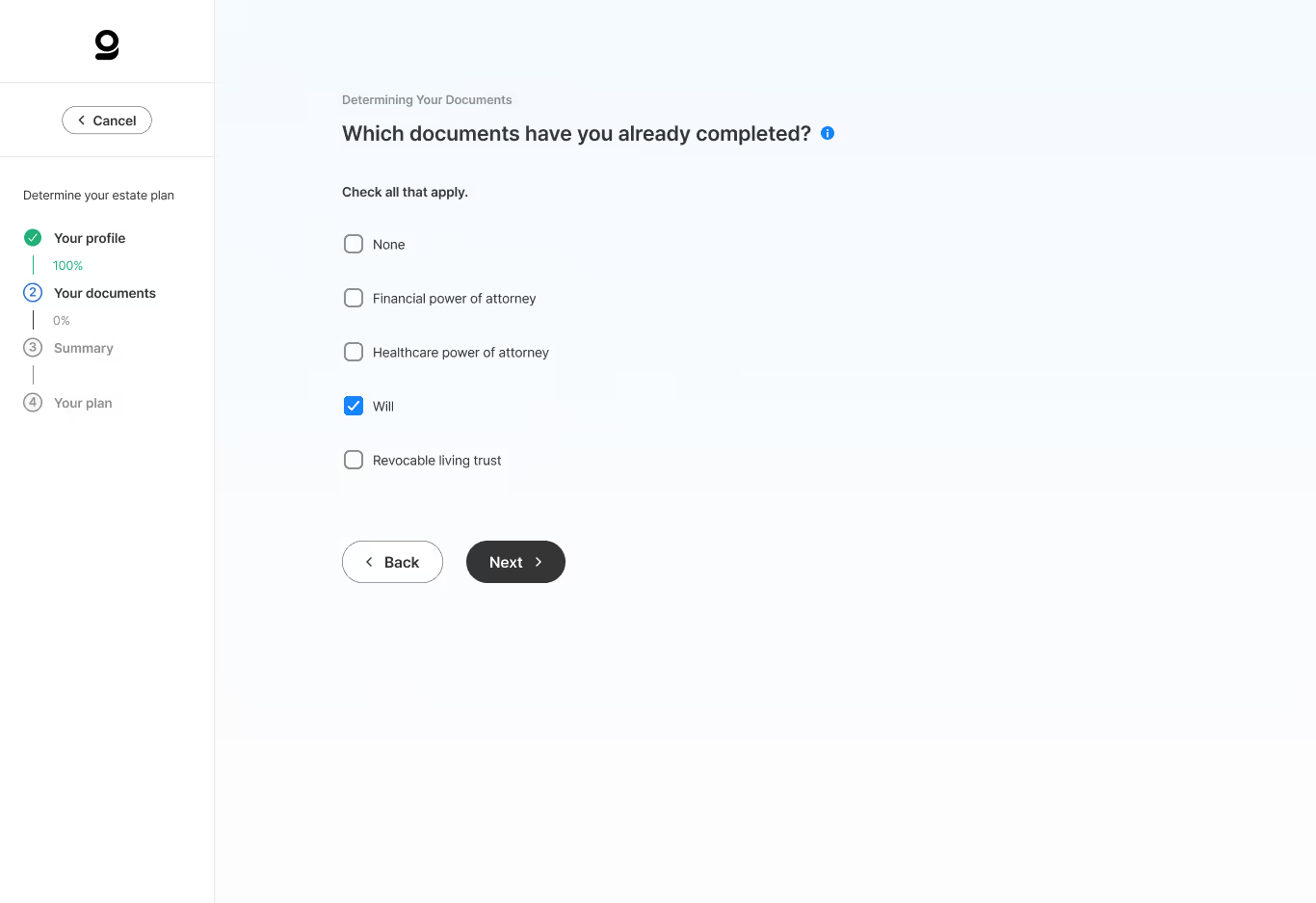
The next step is always visible
Workflows were rebuilt around where someone actually is in a process, with progress and context shown at each stage. A legally complex task stops depending on remembering what comes next.
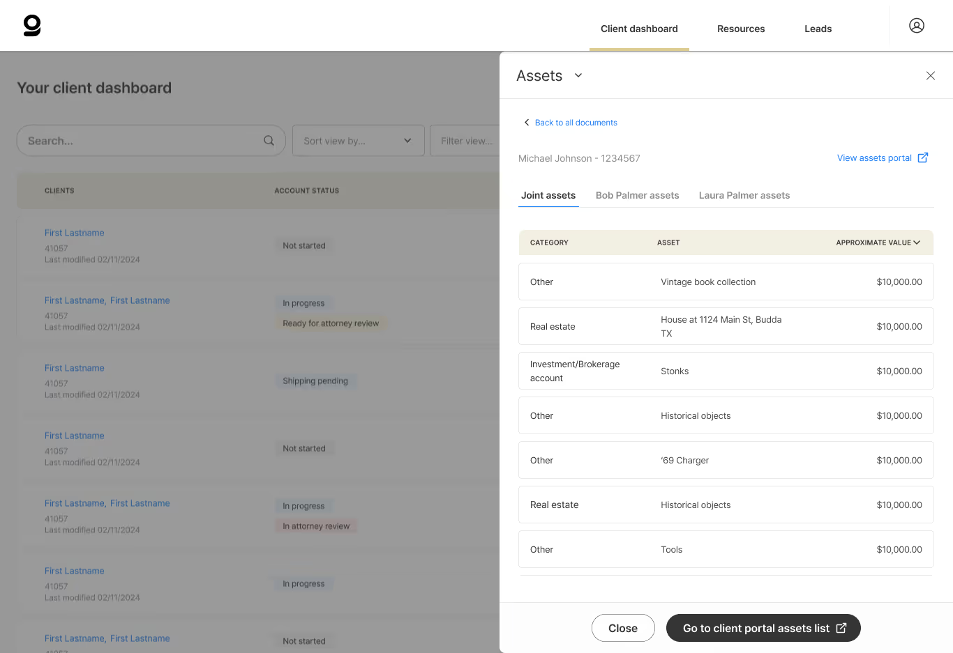
Navigation that holds as the platform grows
Document access, asset management, and the client portal sit in a structure with room for what came later. New capability can be added without the interface getting harder to move through.
Motion that points at what changed
Animation is used to show hierarchy and draw attention to the action that matters, not for decoration. The interface tells you where to look.
"A Stronger Idea Design was highly attentive to detail with our mission and not just our design, demonstrated excellent project scoping skills, and was end-user oriented. Three non-negotiable requirements for our product redesign."
Key outcomes & value delivered
The platform clearly makes visible decisions clients make, and the advisors and attorneys guiding them can see where every client stands without hunting for it.
Improvement in task completion rates
Reduction in user errors across critical workflows
Documents managed on the platform
Common questions
Because there's no second attempt to recover on. A parking app can absorb a confused first try. A mistake in an estate plan is often emotional and difficult to undo . The design has to earn confidence in the moment, not through iteration.
Only if it's generic. Step-by-step guidance tied to exactly where someone is in a specific decision reduces friction. A static help page or a wall of legal text increases it.

You can't act on what you can't see.
Operators who could only see pieces of the system gained a complete view of the parking ecosystems they managed.
Flowbird Hub
Supporting 100+ parking ecosystems worldwide
Let's talk about your project.
Every engagement begins by understanding where you are today, what you're trying to accomplish, and where thoughtful product design can create the greatest impact.