


A design system codifies decisions. It doesn't make them. When the decisions underneath were never made explicitly, a growing system doesn't produce coherence. It produces a more organized version of the same confusion.
It usually shows up in product teams around the time they start to scale. The design system exists, the component library is documented, and reviews are happening. But the product is showing signs of getting less coherent, not more.
A workflow that works well for the main user type creates friction for everyone else, etc. The system keeps expanding to cover the gaps, but the gaps keep showing up somewhere else or the system can't seem to accommodate assets that are truly needed.
The usual response makes it worse
The standard move is to invest more in the system. Better documentation. Tighter governance. More components, more variants, more rules about when to use what. A coherence problem can survive all of it, which is the clue that something has been misdiagnosed. The design system is being used to solve a problem it has no ability to solve. I've found the problem usually isn't inside the system. It's in the product architecture the system is trying to express.
The system sits downstream of something
A design system captures the patterns a product uses, the components those patterns need, and the rules that hold them together. That's genuinely useful.
What a design system cannot do is make the decisions that determine which patterns should exist at all. Those decisions live a layer up. How do the product's user types relate to each other? Where do their workflows cross? What happens at those crossings? What is each role allowed to see of the others?
Those are product architecture decisions, and they have to exist before a design system can express them. If they don't exist, the system starts absorbing the ambiguity.
What absorbing ambiguity looks like
You can usually see it in the component count. A component gets created to handle a case that doesn't quite fit. Then a variant of it, for the case that doesn't quite fit the first exception. Then a rule about when to use the variant.
None of those additions are mistakes on their own. Each one solves the problem in front of the person who made it. Together they're a record of decisions the organization never made, written in component form.
That's why more governance doesn't help. Governance is how you enforce a decision, but it does nothing when the decision was never made.
Example: Three roles that didn't need the same things
I spent nearly three years as chief product designer at Estate Guru, an estate planning platform, where I was the only designer and built the design system from scratch.
Estate planning is a good place to watch this play out, because the product sits between people whose interests only partly overlap. A financial advisor brings the client. An attorney does the legal work and carries the legal responsibility for it. The client and their family live with the result.
The traditional version of this is a handoff. The advisor sends the client to an attorney, and often doesn't get the relationship back. That handoff is the thing the product exists to replace. So the platform has to keep the attorney's authority genuinely intact, because the legal work is the point, while also keeping the advisor in the middle of a relationship they used to lose. Those aren't the same goals. The product has to provide for all of them.
None of that is visible from inside a component library. But almost every interface decision on the platform is downstream from it.
The decision no component could have surfaced
Late in testing, advisors told us they needed to be able to hide pricing from their clients in the client portal. They wanted to handle the money conversation themselves, in their own way, at their own time. We hadn't anticipated it. It didn't come up in the initial research. It surfaced only when people used the product.
This isn't a request for a component. It's a question about whether two roles looking at the same record should see the same record. Once you ask it out loud, you have to answer it deliberately, because the answer defines what the client portal is: a window onto the advisor's workspace, or a separate product with its own rules about what crosses the boundary?
We made it an account-level setting, which meant the platform now had an explicit position on the question. It became one of the things institutional clients cared most about.
No amount of design system rigor would have produced that. There's no governance process that surfaces an unasked question. The component that displays a price was fine. The pattern was fine. What was missing was a decision about visibility between roles, and the system had been quietly assuming an answer to it the entire time.
Which patterns are shared, and which are not
The same platform gave me the clearest version of a question every design system eventually has to answer: what belongs to everyone, and what belongs to one role?
Testing across advisors, attorneys, institutions and end clients produced a clean split. Status visibility, document access and progress indication mattered to all of them. Pricing control, attorney review queues and beneficiary-facing material were role-specific.
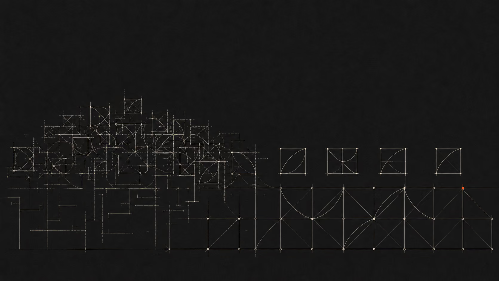
That split is a design system specification. It tells you which patterns are shared and have to stay consistent, and which are role-scoped and are allowed to diverge. It's also a specification you cannot derive from inside the system. It came from deciding how the roles relate, and then watching where that held and where it did not.
Get that split right and the system stays coherent as the product grows, because new work lands on one side of the line or the other. Get it wrong, or never make it explicit, and every new feature becomes a fresh argument about whether this thing is a variant or a new pattern. Those arguments feel like design system problems. They're architecture problems wearing a design system costume.
The old platform's sprawl was a record of the same thing
The product I inherited at Estate Guru had multiple dashboards that existed for reasons nobody could explain, overlay panels stacked on top of other overlay panels, and redundant columns in dense tables that no longer served anyone.
It would be easy to read that as a design quality problem, and some of it was. But most of it was accumulated indecision. Each of those dashboards was somebody's reasonable answer to a question about who this screen is for, made in isolation, at a different time, from a different assumption.
Consolidating them wasn't really a design exercise. It was making one decision, once, in the open, about what the primary workspace is and who it serves. The interface work after that was comparatively easy, because there was finally something definite to express.
Good tooling has made this easier to miss
Building a comprehensive design system has never been faster. Figma, Storybook, LLMs, and the rest of the current tooling will take you a long way in a short time, and the output looks credible early.
Speed is not the problem here. The problem is that none of it asks whether the proper decisions underneath have been made. AI has removed the friction that used to force teams to slow down and think, and nothing has replaced that step in the process. So it's now entirely possible to build a sophisticated system on an unstable foundation quickly, and to look productive the whole time.
The question that surfaces the issue
If your design system is growing and product coherence isn't improving, the useful question isn't what is wrong with the system. It's: what product decisions is this system trying to express, and were those decisions ever actually made?
A clear answer sounds like documented positions on user types, on how workflows relate, and on what each role can see of the others. If that's true, the system is on solid ground and more investment in it will pay.
If what comes back is uncertainty, or a set of assumptions that turn out to vary by team, the foundation is unclear. More investment in the system won't stabilize it. It will make the reason for the instability more opaque.
Where the investment pays
None of this makes design systems the wrong investment. It's just the wrong starting point.
A system built after the architecture is explicit is smaller, steadier, and cheaper to maintain, because the decisions it expresses aren't still moving underneath it. A system built to compensate for decisions nobody made will keep growing, and the growth will keep getting mistaken for progress.
The most productive use of design system investment sits downstream of architectural clarity, not upstream of it.
References
Brad Frost, Atomic Design (2016). The standard reference for design system methodology, and the source of the interface inventory technique.
Nielsen Norman Group, State of UX 2026 (January 2026). https://www.nngroup.com/articles/state-of-ux-2026/